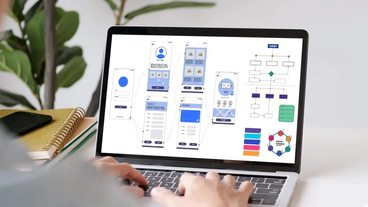

Your Figma design looks flawless, every pixel perfectly placed, every margin meticulously aligned. But when it’s time to ensure pixel-perfect accuracy from Figma to WordPress, things can quickly spiral into a frustrating game of “spot the difference.”
If you’ve ever watched your carefully crafted mockup fall apart in the transition to a live site, fonts shifting, spacing collapsing, or colors going rogue. You’re not imagining it. The disconnect between design and development is a common one, but it doesn’t have to be your reality.
This guide isn’t just about nitpicking visuals. It’s about preserving the integrity of your design across platforms and devices. Whether you’re handing off to a developer or building it all yourself, we’ll cover the exact tools, techniques, and best practices that bridge the gap with surgical precision.
So if you’re tired of compromises and want your WordPress site to match your Figma file down to the last pixel, you’re in the right place. Let’s transform “almost there” into absolutely perfect.
What Does Pixel-Perfect Really Mean?
Pixel-perfect accuracy when transferring a design from Figma to WordPress means ensuring that every visual element, spacing, typography, and interactive feature looks and behaves exactly as intended in the original Figma design once implemented on the live WordPress site. This process requires a meticulous approach, as designers and developers must collaborate to convert Figma mockups into fully functional web pages without compromising on design quality or user experience.
Achieving this level of precision involves carefully coding the website’s front-end using HTML, CSS, and JavaScript files that closely replicate the Figma design specifications. These files are then integrated into the WordPress theme folder, which acts as the foundation for the site’s design and structure.
Any deviation, whether in padding, font size, or hover effects, can affect the overall aesthetic and professionalism of the website. Moreover, when developers convert Figma designs, they must also consider responsiveness and cross-browser compatibility to maintain pixel-perfect accuracy across devices and platforms.
This approach ensures that the WordPress site not only reflects the original creative vision but also provides a seamless and visually consistent experience for users. By prioritizing detail, structure, and clean coding practices, developers can bridge the gap between Figma prototypes and fully realized WordPress themes with exact precision.
Why Pixel-Perfect Accuracy is Challenging
Achieving pixel-perfect accuracy when converting Figma designs into a live website is challenging due to several factors that impact both the design and development processes. One major challenge is the inherent difference between static design tools like Figma and the dynamic, code-driven environment of the web, where factors like screen resolutions, browsers, operating systems, and device types can all render elements slightly differently.
While a design might look flawless in Figma, translating it into a responsive layout using CSS and JavaScript often requires adjustments to maintain consistency across these variables. Additionally, developers must contend with limitations in web technologies and browser quirks that can prevent exact replication of certain design elements or behaviors.
Typography, spacing, and alignment may appear differently depending on system fonts, rendering engines, or scaling settings, which complicates efforts to maintain precision. Moreover, the need for responsiveness further complicates pixel-perfect accuracy, as layouts must adapt seamlessly to various screen sizes without breaking the original design intention. Balancing performance optimization with design fidelity is another layer of complexity, requiring developers to make careful compromises to achieve both aesthetic precision and functional excellence.
Preparing Figma Designs for Development
Let’s go over some of the key aspects of preparing Figma Design for WordPress development.
Optimize Figma Files for Handoff
Preparing Figma designs for development is a crucial step to ensure a smooth and efficient handoff between designers and developers. To optimize Figma files for handoff, designers should prioritize organization, clarity, and consistency. Begin by structuring the file using clear page names, logical layer grouping, and meaningful naming conventions.
Use Figma’s components, styles, and assets libraries to maintain design consistency and simplify updates. Ensure that text styles, colors, grids, and spacing are standardized and properly labeled. All interactive elements, such as buttons, links, or hover states, should be clearly defined and annotated if necessary.
Leveraging Figma’s prototyping features can help communicate user flows and interactions more effectively. It’s also essential to clean up unnecessary layers, hidden elements, or unused components to reduce clutter and improve file performance.
Developers should have easy access to inspect elements, download assets, and understand specifications like dimensions, spacing, and responsive behavior directly from the Figma file. Including documentation or notes within the file can further clarify design decisions and edge cases. Ultimately, a well-prepared and developer-friendly Figma file fosters better collaboration, reduces misunderstandings, and accelerates the implementation process, leading to a more seamless transition from design to development.
Exporting Assets Correctly
When preparing Figma designs for development, exporting assets correctly is a critical step to ensure that the final product meets both design and functionality expectations. Especially when working on projects like a fully functional WordPress website, precision in asset export can greatly impact the quality of the outcome.
Designers should ensure that all necessary images, icons, and graphics are exported in appropriate formats (such as SVG, PNG, or JPEG) with the correct resolutions for web usage, ensuring scalability and performance optimization.
This is particularly important in WordPress theme development, where clean, optimized assets contribute to faster loading times and better user experiences. For dynamic elements such as sliders, hover effects, or interactive menus, it is essential to export assets in a way that allows developers to integrate them seamlessly with code. Therefore, ensuring that these elements remain flexible and functional within the CMS environment.
Clear labeling and organizing of assets in Figma will further aid developers in accurately implementing the visuals. To make sure the WordPress site matches the approved design mockups, designers should also provide guidelines on how assets should appear in different breakpoints or screen sizes. This attention to detail helps deliver a pixel-perfect design that ensures consistency across devices and browsers.

WordPress Website Development Best Practices for Pixel-Perfect Results
Let’s explore some WordPress website development best practices for pixel-perfect results. Some of these practices include setting up a proper front-end workflow. Furthermore, you want to leverage CSS and flexbox grid properly. Additionally, consider front rendering and typography. Finally, remember about QA & testing techniques for WordPress themes. Dive into more details below.
Setting Up a Proper Front-End Workflow
Achieving pixel-perfect results in WordPress website development requires setting up an efficient front-end workflow aligned with best practices. The process often starts with a precise WordPress conversion, where static design files such as PSD or Figma are carefully translated into a functional WordPress theme.
Developers should meticulously break down the design into modular, reusable components while ensuring that the theme’s PHP files are organized and coded cleanly. Thus, to integrate seamlessly with WordPress template tags, which help dynamically pull and display content. Utilizing custom CSS stylesheets ensures the visual consistency of elements across browsers and devices. Meanwhile, keep the styles modular and maintainable.
A proper front-end workflow also involves integrating task runners and preprocessors like SASS and building tools that help automate tasks such as minification, image optimization, and live browser syncing. Furthermore, developers should adhere to the principle of separating presentation from functionality. Thus, leveraging the power of WordPress functionalities like custom post types, widgets, and shortcodes to enhance dynamic content without cluttering the design layers.
Meticulous testing across devices and browsers is essential to catch inconsistencies early. Overall, a streamlined front-end workflow in WordPress development ensures that the website remains flexible, pixel-perfect, and easy to maintain while fully utilizing the powerful ecosystem that WordPress offers.
Leveraging CSS & Flexbox/Grid Properly
Another way to ensure pixel-perfect accuracy from Figma to WordPress is to leverage CSS and JavaScript files along with the flexbox/grid properly. Instead of relying solely on page builders or bloated themes, developers can write clean, modular CSS that precisely mirrors the spacing, alignment, typography, and responsive behaviors defined in the Figma mockups.
Flexbox is excellent for managing one-dimensional layouts, such as aligning buttons, centering content, or distributing space evenly within a row. For more complex, two-dimensional structures, CSS Grid allows developers to recreate intricate layouts with precision, maintaining exact column widths, row heights, and alignment as designed. JavaScript comes into play for dynamic interactions, animations, and fine-tuning behaviors that CSS alone cannot handle, ensuring the site feels as polished as the original prototype. By combining these technologies thoughtfully, developers can achieve a faithful, high-performance front-end that aligns pixel-for-pixel with the designer’s vision in Figma, all while maintaining clean code and flexibility for future updates.
Font Rendering and Typography Considerations
You also want to ensure font rendering and take typography considerations when converting Figma designs to WordPress. A professional WordPress development service will ensure that the fonts selected in Figma are accurately represented in the final WordPress site, accounting for issues like browser compatibility, loading performance, and fallback options. This process often involves using custom fonts or integrating them through a WordPress plugin that manages typography settings efficiently.
By doing so, designers and developers can take full advantage of WordPress features such as customizable themes and dynamic content blocks. Therefore, it is essential to ensure the visual style remains consistent across all devices and screen sizes.
From the WordPress dashboard, users can further fine-tune font sizes, line heights, and text alignment to align with the branding guidelines set out in the Figma prototype. Effective font rendering is not just about aesthetics, it also impacts readability and user experience, making it a critical element in professional WordPress development.
Developers might utilize WordPress functions to enqueue font stylesheets properly and avoid conflicts or performance issues. By giving typography the attention it deserves, especially when using advanced WordPress features and plugins. Web developers can create visually cohesive websites that reflect the original design vision while leveraging the power and flexibility of the WordPress platform.
QA & Testing Techniques for WordPress theme
Finally, it is important to run QA testing techniques to ensure a successful WordPress conversion process. Once the design phase is complete and you convert Figma to WordPress, thorough quality assurance helps verify that every feature functions correctly across different browsers and devices.
QA testing is crucial whether you’re modifying existing theme files, starting from scratch, or choosing a suitable WordPress theme. It ensures the visual elements from your original Figma designs are faithfully represented, with attention to layout accuracy, responsiveness, and usability.
Additionally, testing ensures that the WordPress installation is secure, up-to-date, and compatible with plugins and custom code. In many cases, the conversion process also involves integrating custom HTML files into the WordPress environment.
These files must be tested to confirm that they are properly styled and that they interact seamlessly with the WordPress backend. Especially when developers convert Figma to WordPress manually, QA testing becomes even more essential to catch issues that automated tools might overlook.
Functional testing, usability testing, and performance optimization are all part of the QA process. These steps confirm that the final site not only looks good but also performs well for users. In short, thorough QA testing is the final safeguard in delivering a polished, professional, and fully functional WordPress conversion.

Common Mistakes to Avoid when Converting Figma to WP
Here are some common mistakes to avoid when converting Figma designs to a stunning WordPress website.
Ignoring Responsive Variants
One of the most common mistakes when converting a Figma design to a WordPress (WP) site is ignoring responsive variants. Figma allows designers to create responsive layouts using constraints, auto-layouts, and multiple frame sizes to showcase how a design should look across devices. However, developers sometimes overlook these responsive cues or fail to implement them accurately in WordPress.
The result is a site that may look great on a desktop but breaks or displays poorly on tablets and smartphones. This can lead to a poor user experience, increased bounce rates, and even SEO penalties due to mobile usability issues. Ignoring responsive variants also undermines the purpose of a design system that anticipates various screen behaviors.
Developers must thoroughly analyze all screen versions provided in the Figma file, paying close attention to breakpoints, layout changes, typography scaling, and image behavior. Tools like CSS Grid, Flexbox, and media queries should be used to replicate Figma’s responsiveness within the WP theme or builder.
Additionally, if using a visual builder like Elementor or WPBakery, one must test and tweak layouts at each breakpoint to ensure fidelity to the original design. Ultimately, respecting the responsive variants in Figma leads to a more cohesive, professional, and accessible WordPress site.
Skipping Baseline Grids
Skipping baseline grids during the conversion from Figma to WordPress is a subtle yet critical mistake that can compromise the visual harmony and readability of a website. In Figma, baseline grids help maintain consistent vertical rhythm across text elements, ensuring that headers, paragraphs, and other components align neatly regardless of content length or layout complexity.
When developers ignore these grids during implementation, the final WordPress site often looks slightly “off”: text blocks may feel uneven, spacing can appear inconsistent, and the overall polish of the design is lost. This inconsistency can diminish the professionalism of the site, affect legibility, and create a disjointed user experience.
In WordPress, whether you’re coding a custom theme or using a page builder, it’s crucial to replicate the vertical spacing defined by the baseline grid in Figma. This often requires precise use of margins, line-heights, and padding in CSS, along with consistent application of typographic scales.
Developers should not only review Figma’s visual grid settings but also consult with designers to understand their intent. Maintaining baseline alignment enhances both aesthetics and functionality, giving the site a balanced, readable structure that holds up across various content scenarios. Ignoring it undermines the design’s foundation and results in a less cohesive product.
Over-reliance on WordPress Page Builders
When converting a Figma design to WordPress, one of the most common mistakes is an over-reliance on WordPress page builders, particularly the Elementor page builder plugin. While these tools offer convenience and speed, they can lead to bloated code and performance issues if not used carefully.
Many WordPress developers fall into the trap of replicating every visual detail from Figma using Elementor, instead of leveraging the more native and efficient WordPress block editor. This approach often neglects scalability, maintainability, and performance.
Moreover, overusing Elementor or similar plugins may limit access to advanced dynamic features that are better handled through custom development or purpose-built plugins. To avoid this, it’s essential to strike a balance: use page builders when necessary, but always prioritize clean code and performance.
Incorporating interactive and dynamic features through custom code or vetted plugins from the WordPress plugin repository ensures that your site remains lightweight and adaptable. The goal is not just to make the site look like the Figma design but to translate it into a fully functional website that’s optimized for real-world performance and user experience. Understanding how and when to use different tools, instead of defaulting to page builders, can dramatically improve the quality and sustainability of the final WordPress product.

TL;DR: Steps to ensuring Pixel-Perfect Accuracy from Figma to WordPress conversion
Achieving that elusive pixel-perfect finish when transitioning from Figma to WordPress isn’t about obsessive perfectionism. It’s about honoring the design’s intent, preserving user experience, and delivering a brand’s vision without compromise.
From exporting assets with precision to mastering CSS layout techniques, and from font rendering nuances to rock-solid QA practices, every detail counts when you want to ensure pixel-perfect accuracy from Figma to WordPress.
But let’s be real, pulling this off flawlessly requires more than just good intentions. It demands a well-oiled process, deep dev chops, and a sharp eye for design fidelity. Whether you’re a designer who wants your vision respected or a brand that won’t settle for “close enough,” precision is non-negotiable.
At Acclaim, we speak both design and development fluently, and we specialize in translating beautiful Figma files into pixel-perfect, high-performing WordPress sites. Want your design to live on the web exactly as you imagined it? Drop us a line. We’ll make sure your pixels land perfectly where they belong.