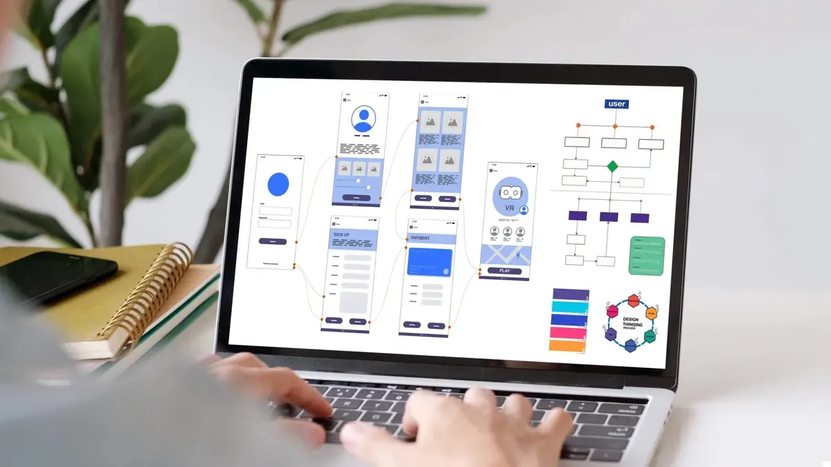

Ever wonder why some WordPress sites feel like digital magnets, pulling you in and getting you to click, subscribe, or buy, while others just… exist? That’s not luck, it’s designing a WordPress site for conversion rates with purpose. It’s not just about aesthetics; it’s about strategy.
Too many WordPress sites focus solely on visuals, forgetting that beauty without brains won’t boost your bottom line. Conversion-focused design blends psychology, UX principles, and persuasive layout strategies to turn browsers into buyers, readers into subscribers, and visitors into loyal fans.
In this post, we’ll break down how to design smarter, not just prettier. From layout hacks to call-to-action placement, you’ll learn how to rework your WordPress site into a high-converting machine. Ready to stop guessing and start growing? Let’s dig in.
What is a Conversion Rate?
A conversion rate for WordPress sites refers to the percentage of website visitors who complete a desired action, such as making a purchase, signing up for a newsletter, submitting a contact form, or downloading a resource.
This metric is crucial for understanding how effectively a WordPress site is meeting its goals. For example, if a site receives 1,000 visitors and 50 of them complete the desired action, the conversion rate is 5%.
Improving conversion rates involves optimizing various elements like site speed, mobile responsiveness, calls to action, landing page design, and content clarity. WordPress users often utilize plugins such as MonsterInsights, WPForms, or OptinMonster to track and boost conversions.
By monitoring and enhancing this rate, website owners can ensure they’re getting the most value from their traffic. Ultimately, increasing return on investment (ROI) and achieving business objectives more efficiently. A strong conversion rate signals that the site is both user-friendly and purpose-driven.
Why do conversion rates matter?
There are multiple reasons why conversion rates matter when designing WordPress sites:
- Conversion rates provide tangible proof that your website is doing what it’s supposed to: whether that’s generating leads, selling products, getting email sign-ups, or driving other desired user actions.
- Improving your conversion rate means you get more value from the same amount of traffic. This boosts ROI on marketing efforts like SEO, PPC, or social media campaigns.
- Sites with higher conversions often have better UX: clear navigation, fast load times, and mobile-friendly design. If users can easily find what they need, they’re more likely to convert.
- Tracking conversion data helps you make informed design choices. You can run A/B tests, tweak layouts, CTAs, or page content to see what actually improves performance.
- At the end of the day, more conversions mean more customers, clients, or subscribers. A WordPress site that converts well becomes a growth engine for the business it represents.
Finally, if your site converts better than your competitors’, you’re getting more out of the same market, often without needing more ad spend or traffic.
10 effective tips to boost conversions through design
Let’s explore 10 effective ways to boost conversion rates through the right design of your WordPress website. Some of these include using clear bold call to actions, keeping navigation simple, making it mobile first, and so much more. Dive into more details below.
Use Clear, Bold Calls-to-Action
One of the most effective ways to boost conversion rates on your WordPress website is by using clear, bold calls-to-action (CTAs) that guide users toward taking the next step. A well-structured WordPress theme can help highlight these CTAs by offering intuitive navigation and clean layouts that draw attention to your most important content.
For successful conversion rate optimization, your design should not only be visually appealing but also functional, making it easy for visitors to engage with your offers. Integrating tools like Google Analytics can provide valuable insights into user behavior, helping you refine your CTA placement and design for better results. You can also enhance performance with WordPress plugins designed specifically for A/B testing, lead generation, and real-time tracking.
Ultimately, your goal is to convert visitors into subscribers, leads, or customers, and strategically designed CTAs play a critical role in that process. Make sure every element on your site works together to encourage engagement and drive conversions.
Keep Navigation Simple
Keeping navigation simple is a crucial element in boosting your website’s conversion rates. A clean, intuitive menu structure helps users find what they’re looking for quickly, reducing friction and encouraging them to take action.
Whether you’re running a blog or an online store, easy-to-understand navigation keeps users engaged and focused on your content or products. Overly complex or cluttered navigation can confuse visitors and lead to higher bounce rates, which can negatively impact your visibility on search engines.
Instead, streamline your menus, limit the number of top-level items, and organize submenus logically to improve the user experience. Use clear labels for web pages so visitors know exactly what they’ll find when they click a link.
When users can easily move through your site, they’re more likely to complete a purchase, fill out a contact form, or sign up for a newsletter, directly boosting your website’s conversion rates. Ultimately, your website’s design should support a smooth journey from entry to conversion, and simple, effective navigation is a key part of that experience.

Make It Mobile-First
One of the most effective ways to boost conversion rates through the design of your WordPress website is to make it mobile-first. With the majority of users now accessing websites from smartphones and tablets, mobile responsiveness is no longer optional. It’s essential.
A mobile-first approach to web design ensures your site looks and functions beautifully on smaller screens, which helps reduce bounce rates and keep users engaged. Clean and efficient use of CSS and JavaScript files is crucial in this process, as bulky or unoptimized code can significantly impact page load times, leading to user frustration and lost conversions.
Faster loading websites are more likely to retain visitors and encourage them to take action. Additionally, search engines favor mobile-optimized sites, which can lead to increased website traffic. By prioritizing performance and user experience on mobile devices, you not only enhance your site’s usability but also create a direct path to higher engagement and improved conversion rates.
Add Social Proof Where It Matters
Adding social proof where it matters is a powerful strategy to increase credibility and boost conversion rates on your WordPress website. Whether you run an online business, an Ecommerce store, or an affiliate website, showcasing positive feedback from real users can greatly influence potential customers’ buying decisions.
Social proof, such as testimonials, reviews, star ratings, case studies, or trust badges, builds trust and reassures visitors that others have had positive experiences with your brand. The key to maximizing its impact lies in strategic placement.
Position social proof elements near call-to-action buttons, product descriptions, and checkout pages to reinforce confidence at critical decision-making moments. When used correctly, this tactic can transform a standard site into a high-converting website by reducing hesitation and increasing perceived value.
Moreover, integrating authentic customer feedback on landing pages and product pages can significantly boost sales by leveraging the psychological effect of social influence. In today’s competitive digital space, incorporating social proof effectively is not just smart design. It’s essential for sustained growth.
Use White Space to Focus Attention
Using white space effectively is a powerful yet often underutilized design strategy that can significantly boost conversion rates on your WordPress website. Also known as negative space, white space refers to the empty areas between elements on a page, such as margins, padding, and spacing around text or images.
Rather than being “wasted” space, it plays a crucial role in directing user attention, improving readability, and enhancing the overall user experience. By decluttering your layout and giving content room to breathe, you naturally guide visitors’ eyes to the most important elements: like calls-to-action (CTAs), product details, or lead forms.
A clean, minimalist design can evoke professionalism and trust, which are essential for encouraging users to take the next step. For example, placing ample white space around a prominent “Buy Now” button makes it stand out more clearly and invites interaction.
Additionally, strategically used white space reduces cognitive overload, helping visitors process information more easily and stay longer on your site. In the end, simplicity and clarity can be more persuasive than a crowded or overly complex design.

Optimize Page Speed
One thing to consider when designing a WordPress site for conversion rates is to optimize page speed. Page speed is important for conversion rates and boosting profits. You want to focus on this aspect, that your website is making you money.
You can optimize page speed by following some of these best practices:
- Optimize images using programs such as TinyPNG, and also format them to WebP for the best results
- Minifying JavaScript files and CSS files to improve site speed
- Minimizing reliance on external scripts
- Implemented lazy loading for images, ensuring that off-screen visuals only load when necessary, reducing initial page weight.
Improving your site’s speed doesn’t just help with user experience, it also impacts SEO rankings and lowers bounce rates. Faster pages create a sense of reliability and professionalism, which encourages users to stick around and take action.
Even just a one-second delay in page load time can significantly hurt conversions. On the flip side, a smooth, fast site builds trust and reduces friction between the user and whatever action you want them to take. If you’re running ads or driving traffic from social media, you’re paying for every visitor, don’t lose them to a slow site. Speed is money.
Highlight One Goal Per Page
Also, when creating landing pages, you should try to stick to one goal per page. Trying to accomplish too much at once, such as promoting a product, collecting emails, and encouraging social media follows, can dilute your message and confuse visitors. A landing page should guide users toward one specific action, whether it’s signing up for a newsletter, downloading a resource, or making a purchase.
This clarity not only improves user experience but also makes it easier to measure the page’s effectiveness. By eliminating distractions and keeping the layout, messaging, and call-to-action aligned with one objective, you increase the chances of conversion.
A focused landing page is like a well-written story. It leads the visitor through a beginning, middle, and end with purpose. Each element on the page, from the headline to the imagery and button text, should support that single goal. The more streamlined and intentional your landing page is, the more likely it is to achieve its intended result and drive meaningful engagement with your audience.
Place Important Info Above the Fold
Placing important information above the fold on your WordPress website is one of the most effective ways to boost conversion rates. “Above the fold” refers to the portion of the webpage that users see without scrolling.
Since visitors form impressions within seconds, showcasing key elements like your unique value proposition, call-to-action (CTA), and primary offer in this space can significantly increase engagement. This design strategy ensures that users immediately understand what your site is about and what action they should take.
Whether it’s signing up for a newsletter, booking a service, or purchasing a product, placing the CTA front and center makes it more likely that users will follow through. Make sure the content is clear, concise, and visually appealing.
Use attention-grabbing headlines, high-quality images or videos, and contrasting buttons to guide the user’s eye. Avoid clutter in this space, too much information can overwhelm visitors. Instead, focus on delivering a compelling message that entices users to explore further. A well-structured above-the-fold area acts as a powerful hook, increasing the chances of converting casual visitors into loyal customers.
Use Visual Hierarchy to Guide Eyes
Using visual hierarchy effectively is a powerful way to boost conversion rates on your WordPress website. Visual hierarchy refers to the arrangement and styling of elements on a page to show their order of importance and naturally guide the visitor’s eyes through the content.
When done right, it leads users toward taking specific actions, such as clicking a button, filling out a form, or making a purchase. To create a strong visual hierarchy, prioritize elements like:
- headlines,
- CTAs,
- and key benefits
by making them larger, bolder, or more colorful than supporting text. Use font sizes, colors, spacing, and positioning to create contrast and draw attention to the most crucial parts of the page. For example, a large, bold headline at the top, followed by a slightly smaller subheading and a brightly colored CTA button, provides a clear path for the user’s eyes to follow.
White space is also essential. It helps declutter the design and makes important elements stand out more. When users can easily find what they’re looking for without feeling overwhelmed, they’re more likely to stay engaged and take action, ultimately increasing your conversion rates.
Test and Tweak, Always
Boosting conversions through WordPress website design requires a strategic, data-driven approach, and one of the most effective principles to follow is: Test and Tweak, Always. A website should never be considered “finished” because user behavior, market trends, and technology are constantly evolving.
Begin by setting clear conversion goals, whether it’s sign-ups, purchases, or downloads, and use tools like Google Analytics or Hotjar to monitor user interactions. Implement A/B testing for key elements such as call-to-action (CTA) buttons, headlines, layout designs, and color schemes.
For instance, simply changing the wording or placement of a CTA can significantly impact click-through rates. Pay close attention to page load times, mobile responsiveness, and navigation flow, these elements directly influence user experience and decision-making.
WordPress offers a wide range of plugins to facilitate testing and optimization, such as Elementor for design flexibility and OptinMonster for lead capture experimentation. Don’t be afraid to make small, incremental changes and measure their impact; over time, these tweaks can lead to substantial improvements in conversion rates.
Ultimately, conversion optimization is not a one-time task but an ongoing cycle of experimentation, analysis, and refinement. By continuously testing and tweaking, you ensure your site remains aligned with your audience’s needs and expectations, maximizing its effectiveness.
Take advantage of professional design services for your WordPress site to boost conversion rates
If you’re looking to increase engagement and drive higher conversion rates on your WordPress site, investing in professional design services can make all the difference. A well-designed website isn’t just about aesthetics. It’s about creating a seamless user journey that guides visitors effortlessly toward your goals, whether that’s making a purchase, signing up, or contacting you.
Expert UX/UI designers specialize in crafting intuitive layouts, compelling visuals, and user-friendly navigation that keep your audience engaged and reduce bounce rates. They understand how to combine form and function, using strategic placements, color theory, and mobile-first principles to ensure your site works perfectly across all devices.
By focusing on the user’s experience at every touchpoint, these professionals can significantly improve your site’s performance and overall ROI. Don’t leave your conversions to chance with a cookie-cutter template, unlock the full potential of your WordPress site with custom design solutions tailored specifically to your audience and goals.
Ready to elevate your online presence and turn more visitors into loyal customers? Take advantage of our specialized UX/UI design services today and start building a site that truly works for you.

TL;DR: Summarising Designing a WordPress Site for Conversion Rates
Every click counts, and every design decision matters. Designing WordPress Site for Conversion Rates isn’t just about aesthetics; it’s about crafting a seamless user journey that motivates action. From strategically placed CTAs and intuitive navigation to responsive layouts and lightning-fast load times, every element on your site should work together to convert casual visitors into loyal customers.
If you want your WordPress site to do more than just look good, if you want it to perform, then it’s time to invest in smart, user-focused design. Whether you’re revamping an existing site or starting from scratch, a conversion-driven approach can drastically improve your results.
Ready to transform your WordPress site into a powerful conversion machine? Drop us a line at Acclaim Design. Our team specializes in creating high-converting websites tailored to your goals. Let’s turn your traffic into tangible results and give your brand the digital presence it deserves. Your next big success could be one design tweak away. Let’s build something incredible together.