 Skip to Navigation
Let’s explore some common web design mistakes to avoid when creating your WordPress site. UX design mistakes can hold you back from creating an online presence and building a successful business. This is why it’s important to keep certain things in mind. Let’s explore these elements below.

WordPress stands as a powerful ally in the pursuit of a captivating online footprint, the journey is not without its challenges. Today, we shed light on the intricate web of “WordPress website design mistakes to avoid” – the stumbling blocks that, if left unattended, can diminish the impact of your digital sanctuary.
Whether you’re a seasoned WordPress enthusiast or a novice navigating the vast landscape of website creation, recognizing and steering clear of common design pitfalls is crucial. Your website isn’t merely a collection of pages. It’s the embodiment of your online identity. In this blog post, we embark on a journey through the digital tapestry. We will unravel the threads of missteps that can compromise the user experience and overall effectiveness of your WordPress site.
Join us as we dissect the nuances of WordPress website design to avoid, once identified and rectified, transforming your digital space into a seamless, engaging, and visually stunning showcase.
Let’s dive into the world of possibilities armed with the knowledge of what to avoid, ensuring that your WordPress website not only captures attention but leaves an indelible mark on every visitor who graces its virtual doorstep.
Why is web design so important?
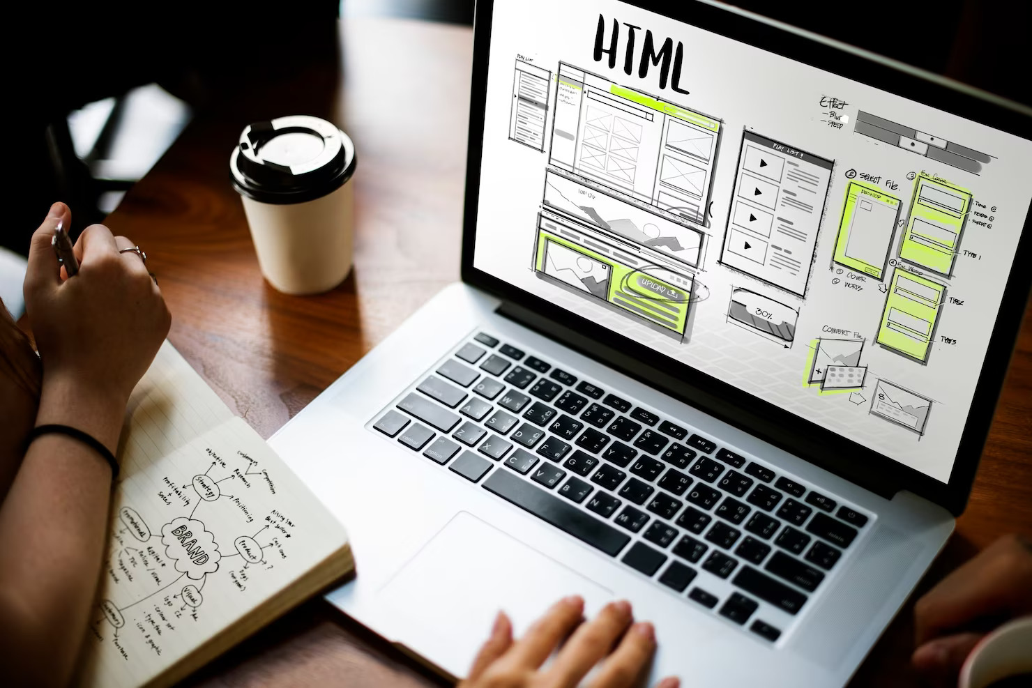
Web design is crucial because it serves as the digital face of a business or individual on the internet. Web design tells web developers how your website should look. It dictates the layout of every page and element on that page. It provides the graphics, font, colors, text size and so much more.
Moreover, the design of a website plays a fundamental role in shaping the user experience, influencing how visitors perceive and interact with the content. A well-designed website not only captures attention but also enhances usability, ensuring that visitors can easily navigate and find the information they seek.
The aesthetics, layout, and functionality of a website contribute to its credibility and professionalism. In today’s highly competitive online landscape, where first impressions matter, effective web design can be the difference between attracting and retaining visitors or losing them to competitors.
Moreover, with the increasing prevalence of mobile devices, responsive and mobile-friendly design has become imperative for reaching a broader audience. A successful web design that is translated into a WordPress website can be the key to a successful online presence and business. The right web design can engage your website visitors and lead to taking appropriate actions.
13 WordPress website design mistakes to avoid
Let’s tackle some common WordPress website design mistakes all web designers should avoid. Also, website owners should be aware of these mistakes, in order to steer the design process in the right direction.
Not having a mobile-first design
A common web design mistake is not creating a mobile-first. Mobile devices are increasingly popular for internet and web browsing. Mobile users are slowly creeping ahead of desktop users. Failure to prioritize mobile responsiveness can lead to distorted layouts, slow loading times, and frustrating navigation for mobile users.
In today’s digital landscape, search engines also prioritize mobile-friendly websites in their rankings, meaning a lack of mobile optimization can adversely affect a site’s search engine visibility. By embracing a mobile-first design philosophy, where the website is initially crafted for mobile devices and then adapted for larger screens. Developers ensure a seamless and enjoyable experience for users across all platforms. A mobile-first approach to web development enhances accessibility, and user engagement, and ultimately contributes to a positive perception of the website, fostering better retention and conversion rates.

Poor site navigation
One of the biggest web design mistakes to avoid is poor site navigation. This mistake undermines the user experience and hampers the overall effectiveness of a website. WordPress offers a user-friendly platform, but without intuitive and well-organized navigation, visitors can quickly become frustrated and disoriented.
Inefficient navigation makes it challenging for users to find the information they seek, leading to increased bounce rates and decreased engagement. A lack of clear menu structures, inconsistent labeling, or overly complex navigation paths can deter users from exploring the site further and achieving their goals. In the menu, you should consider having a parent page, a child page, and so on. So that the user journey is clear. Also, the font and size should be legible, so as to be user-friendly.
In the competitive online landscape, where user attention spans are short, a website’s success hinges on delivering a seamless and accessible navigation experience. WordPress users should prioritize user-friendly navigation to enhance usability, encourage prolonged visits, and ultimately drive the desired conversions.
Not prioritizing accessibility
If you are looking to provide a seamless user experience make sure you don’t neglect accessible designs. It can have significant repercussions for both users and website owners. Accessibility ensures that individuals with disabilities can access and interact with digital content seamlessly. By neglecting accessibility, a website excludes a portion of its potential audience, limiting inclusivity and potentially violating ethical standards.
Moreover, many countries and regions have legal requirements regarding web accessibility, and non-compliance may lead to legal consequences. From a business perspective, an inaccessible website can result in lost opportunities, as users may abandon the site if they encounter barriers.
In contrast, prioritizing WordPress accessibility not only fosters a more inclusive online environment but also helps improve search engine rankings, enhances user experience, and aligns with ethical and legal considerations, making it an integral aspect of responsible and effective WordPress web design.
Not investing in customization
Not investing in customization for a WordPress web design can be a critical mistake for several reasons. While WordPress offers a plethora of pre-designed themes, neglecting customization means sacrificing a unique and tailored online presence.
Generic themes might lack the specific features or aesthetics that align with a brand’s identity or target audience. Customization allows businesses to create a website that stands out in a crowded online space, fostering brand recognition and trust.
Also, it allows you to provide a consistent image, for example, all the CTA buttons are the same size, shape, and color. The font is the same, background colors are the same, etc. Many pages fail to do this.
Moreover, customization enables optimization for user experience and functionality, tailoring the site to meet specific business goals and user needs. Ignoring this aspect can result in a website that feels generic and fails to effectively communicate a brand’s uniqueness or provide a seamless user journey.
Investing in customization ensures that the website aligns closely with the brand’s vision, enhances user engagement, and ultimately contributes to the success of the online presence.
Choosing aesthetics over speed
Slow page load time will impact your online presence. It will cause users to leave your site. Choosing a busy WordPress theme with a cluttered layout may slow down your site. This is because your server has too many elements to process.
Moreover, choosing images and videos that are large in size may also cause a slow-loading website. You can use free tools online like TinyPNG to shrink file sizes without losing quality. When uploading videos try to embed links, as opposed to uploading MP4 files directly to WordPress.
Consider adding the video to YouTube and then to your site. This won’t slow down your site as much. Furthermore, don’t let video audio play as this also impacts speed. Allow the user to choose whether or not they play the video and when.
Animations can also impact website speed. They can be used sparingly and in the right way, so as to not slow down your site. Also, make sure to time them the right way, so that they display properly for the user and there are no strange delays.

Incorrect CTA placement
Incorrect Call-to-Action (CTA) placement in WordPress web design can significantly impede the effectiveness of a website. CTAs serve as the gateway for user interaction and conversion, guiding visitors toward desired actions such as making a purchase, signing up for a newsletter, or contacting the business. If CTAs are poorly placed or difficult to find, users may miss out on crucial prompts, resulting in a lost opportunity for engagement or conversion.
A well-thought-out CTA strategy involves strategic placement on high-traffic areas of the website, ensuring they are visible and seamlessly integrated into the user journey. Neglecting this aspect can lead to frustration for visitors who may struggle to locate the desired action, potentially diminishing the site’s conversion rates.
In WordPress web design, optimizing CTA placement is crucial for maximizing the website’s effectiveness, enhancing user experience, and ultimately driving desired user actions.
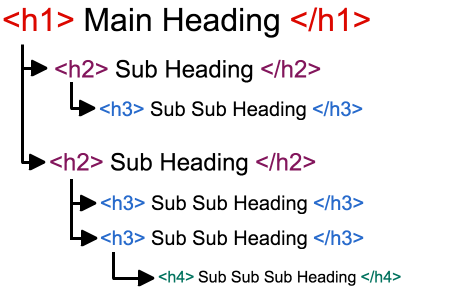
No scannable text
Failing to incorporate scannable text in WordPress design is a mistake that can hinder user engagement and overall site effectiveness. In an era where attention spans are short, users often prefer to quickly scan through content rather than read every word.
Without scannable text, characterized by clear headings, concise paragraphs, and the effective use of bullet points and lists, visitors may find it challenging to grasp the key information efficiently. Scannable text enhances readability, making it easier for users to identify and consume relevant content. WordPress, as a content management system, provides tools and plugins that facilitate the creation of scannable text, such as customizable themes and formatting options.
Ignoring these features risks creating a user experience where information is buried in lengthy paragraphs. Thus potentially leading to high bounce rates as users struggle to quickly find what they need. Incorporating scannable text in WordPress design is essential for maintaining user interest. Also, it helps in promoting content comprehension and ensuring a positive overall browsing experience.
Not changing link colors when active
Neglecting to change link colors when active in WordPress design is a mistake that can compromise user experience and navigation clarity. Active links, those currently selected or visited, typically undergo a color change to provide visual feedback to users, indicating their current location within the website.
Here at Acclaim, if a link is clicked it will change from black to purple. Moreover, the link will be underlined. Thus letting users know where they are on the site.
This visual cue helps users understand the site’s structure and enhances overall navigation. Failure to alter link colors when active can lead to confusion, as visitors may struggle to discern which pages they have already visited or which sections are currently selected. WordPress offers user-friendly customization options, allowing designers to define specific styles for active links.
Ignoring this aspect of design not only undermines the site’s visual coherence but also creates a potential obstacle for users trying to navigate seamlessly through the content. Ensuring that link colors change when active in WordPress design is crucial for maintaining user orientation and facilitating an intuitive browsing experience.
Font isn’t reader-friendly
Do not just a cool or frilly font just because you think that it looks nice. If it’s illegible, it will discourage readers from visiting your site. You can want to choose a Google font that can be used on all browsers and devices. Moreover, fonts that lack proper spacing can strain the reader’s eyes, leading to fatigue and frustration.
Also, you want to use the right size font, so that it’s not too small or too large. You may also consider making your font size adjustable. Moreover, be careful what color of font you want. It should be a good contrast with the background color.
Additionally, poor font choices can undermine the overall aesthetic appeal of a website, potentially diminishing its professionalism and credibility. In a digital landscape where information consumption is rapid, prioritizing reader-friendly fonts ensures that users can easily navigate and engage with the content, fostering a positive and accessible online experience.
Not optimizing media
Failing to optimize media files is a critical WordPress web design mistake that should be diligently avoided. Media files, including images, videos, and audio, contribute significantly to a website’s overall file size. Large and unoptimized media can lead to slow loading times, adversely affecting the user experience.
In today’s fast-paced digital environment, users expect websites to load swiftly, and search engines like Google consider page speed as a crucial ranking factor. Neglecting media optimization can result in:
- higher bounce rates,
- lower user engagement,
- and diminished search engine visibility.
Furthermore, it can lead to increased server resource usage, potentially causing performance issues and increased hosting costs. By incorporating efficient compression techniques, responsive image design, and appropriate file formats, web designers can enhance site performance, improve SEO rankings, and ultimately provide a more satisfying browsing experience for visitors.
Poor use of white space
The poor use of white space in WordPress website design is a critical mistake that can significantly impact the user experience and overall aesthetics of a site. White space, also known as negative space, is the empty space between elements on a webpage. When used effectively, it enhances readability, guides the user’s focus, and contributes to a clean and organized design.
However, the absence of proper white space can lead to a cluttered and overwhelming appearance, making it difficult for visitors to navigate and absorb information. A lack of sufficient white space can also impede readability, causing text to appear cramped and discouraging users from engaging with the content.
Additionally, a well-designed website with appropriate white space conveys a sense of professionalism and modernity. Thus enhancing the overall perception of a brand or business. Therefore, it is crucial for WordPress designers to prioritize thoughtful white space utilization to create visually appealing and user-friendly websites.
Centering the logo
Centering the logo in WordPress website design can be considered a mistake because it deviates from established design conventions and user expectations. Users are accustomed to finding logos at the top left corner of a website, and centering the logo may disrupt the natural flow and navigation patterns users are familiar with. This departure from convention can lead to confusion and a less intuitive user experience.
Additionally, a centered logo might not align with the overall branding and visual identity of a website, potentially undermining consistency and the establishment of a strong brand presence. While creative design choices can be beneficial, it’s crucial to balance innovation with user expectations to ensure a positive and user-friendly website experience.
Not enough contrast between the background and text colors
Insufficient contrast between background and text colors is a critical mistake in WordPress website design as it directly impacts readability and user experience. When there is not enough contrast, text can easily blend into the background, making it difficult for visitors to discern and absorb the content. This issue is particularly problematic for users with visual impairments or those viewing the website in varying lighting conditions.
A lack of contrast can strain the eyes, leading to discomfort and discouraging prolonged engagement with the site. Moreover, it hinders the accessibility of the website, potentially excluding a portion of the audience.
To ensure a positive user experience and broader accessibility, designers must prioritize a clear and discernible contrast between text and background colors, promoting readability and facilitating seamless navigation for all users.
Do you want to check the health of your website?

Fix WordPress website design mistakes to avoid with WordPress Support
When it comes to creating a visually appealing and user-friendly website, WordPress is a popular choice for many users. However, even with its user-friendly interface, it’s not uncommon for website owners to encounter design mistakes. These mistakes can affect the overall look and functionality of their site. These mistakes can range from inconsistent styling and poor color choices to issues with responsiveness and layout. Fortunately, with the help of WordPress Support, website owners can address and fix these design mistakes effectively.
WordPress Support offers a range of services aimed at troubleshooting and resolving design issues on WordPress websites. Experienced WordPress professionals can assist in identifying and rectifying common design mistakes. Thus ensuring that the website aligns with the owner’s vision and meets the expectations of its visitors.
Whether it’s adjusting the layout for a more responsive website on various devices or refining the typography and color scheme for a more cohesive look. WordPress Support provides the expertise needed to enhance the overall design of a website. By availing these services, website owners can not only improve the aesthetic appeal of their site but also enhance the user experience. Therefore, ultimately contributing to the success of their online presence.

TL;DR: Summarizing WordPress website design mistakes to avoid
Let’s summarise the top 13 WordPress website design mistakes to avoid in your next project. Some of these website design mistakes to avoid include the following:
- Not having a mobile-first design
- Poor site navigation
- Not prioritizing website accessibility
- Not investing in customization
- Choosing aesthetics over speed
- Incorrect call to action placement
- No scannable text
- Not changing link colors when active
- Font isn’t reader-friendly
- Not optimizing media files
- Poor use of white space
- Centering the logo on web pages
- Not enough contrast between the background and text colors
However, if you are a business owner and see some of these web design mistakes in your current site, fear not! You can invest in WordPress Support services to help you fix these mistakes. WordPress developers can identify and resolve design mistakes that may impact your website’s credibility and brand identity. They can help you improve your site so that you can attract your target customers. WordPress support will help you achieve a responsive design and fast-loading site. A well-designed website can help attract users and increase conversions.
If you are interested in fixing WordPress website design mistakes to avoid, drop us a line, and let’s get to work. Our team of incredible WP experts can help you get your website in tip-top shape to stand out among competitors.
Comments