 Skip to Navigation
The Mobile-First approach focuses on developing an interactive experience for mobile devices before designing desktop websites. Find out why you need to pick mobile-first for your next website development project.

- What is mobile-first?
- Why mobile-first?
- How to make a mobile-first website?
- WordPress vs Jamstack, which is better for mobile-first?
- Mobile-first development strategy
- Mobile-first design best practices
- Mobile-first design examples
- Tell me the difference between responsive web design and mobile responsive design?
- Mobile-first design strategy summary
Mobiles have remained the leading driver in digitalization over the past decade. Worldwide use of mobiles has resulted in new design and development approaches. This includes mobile-first design and website development.
Mobile-first web development is the process of creating the most effective user interface on smartphones and tablets. Mobile-first web design emphasizes simple minimalism. Web designers & developers alike can provide users with an interactive web-based user experience. While using a responsive design for mobile devices or tablets. Website designers, IT developers, website owners, and others select only what’s essential for the user.
What is mobile-first?
A mobile-first approach involves creating a desktop site from the mobile versions. Small screen design is easier to adapt for large screens, in contrast to a traditionally adapted desktop site.
Why mobile-first?
Mobile-first design plays an essential role in successful product development. Designing on the smaller screens first helps developers focus on the core functions of a business.
Here are some benefits of choosing mobile-first:
- Increases user experience
- Easy to optimize the mobile-first responsive design
- Google loves mobile-first designs
- Content is easy to share with other website users
How to make a mobile-first website?
Making a mobile-first website is one of the best ways to boost your conversion rates. According to AYTM research, mobile users make up more than 50% of all web traffic. This means that if your site isn’t optimized for mobile devices, you could be losing out on a lot of potential customers.
A mobile-first website is designed to work best on a mobile device such as phones or tablets. This means that any content that is aimed at a smartphone user should be built for the mobile format first. So that it looks and works well across different devices. This is especially important if you plan to target your website at a wide audience, as you will need to make sure that it works on each type of device.
- Use a responsive design – which will adapt the design of your site’s layout based on the size of the device it’s being viewed on.
- Ensure text is readable – by using bold and large typefaces, as well as avoiding overusing white space.
- Ensure content is accessible – by making sure navigation links appear at the top of each page, as well as ensuring text is zoomable.
- Enable touch navigation – which allows users to navigate through your site by touching and dragging around the screen.
Some other techniques to keep in mind are optimizing images for mobile display. You can also use techniques parallax scrolling to give your site an engaging feel. By addressing these three areas, you can create a much more engaging experience for users on smaller devices.
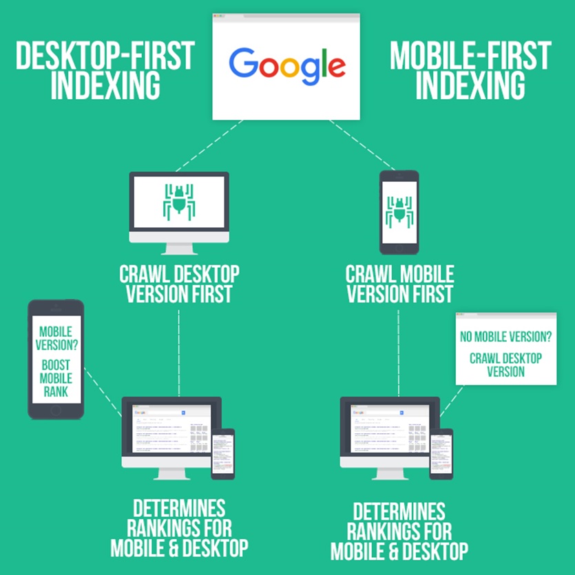
What is mobile-first indexing? Why is it important?
It’s a relatively new way for marketers to track their customers’ movements and behavior as they go about their daily lives. When people buy something, they generally do so via a mobile device. With this in mind, you can now track whether your customers are buying from your store or not – and potentially where they’re buying from. This means you can target them with relevant offers and discounts as they’re out and about. It also allows you to see which devices they’re using when they purchase things.
This is important because it’s becoming more and more common for people to use multiple devices at once – be it smartphones, tablets, or even computers. When you know which device is being used, you can tailor your offers accordingly to best suit the individual user. In addition, by seeing how often your customers are visiting your store compared to how often they’re buying items from there, you can see if there’s anything that needs to be improved.
- The first step in indexing your mobile site is to get your page listed in search engines. To do this, you need to have a mobile-friendly website that can be indexed by search engines like Google, Bing, and Yahoo. You can index your mobile-friendly site using Google Search Console. When your page is listed on search engine results pages (SERPs), it’s considered indexed.
- The next step is to optimize your page for better visibility on SERPs. There are many things you can do to increase the likelihood of being found by searchers. They include optimizing titles and meta descriptions, improving content quality, and adding relevant keywords to your site.
- Once you’ve optimized your page, you can start leveraging the power of mobile indexing. To be indexed by a mobile device, your site must meet specific criteria set by Google. While there are several ways to do this, one of the simplest is through the use of mobile-optimized URLs.
WordPress vs Jamstack, which is better for mobile-first?
Firstly, let’s differentiate between 👉 WordPress websites 👈 and Jamstack websites. WordPress sites are built on an open-source platform, whereas Jamstack sites are developed using modern architecture.
When developing a new project using WordPress as your base, you can make a website that is mobile-first. You can use pre-existing WordPress themes with mobile-friendly designs or you can use bespoke themes. We highly recommend the latter option.
Jamstack sites on the other hand have the advantage that their backend and presentation layer is decoupled. So what does this mean? When it comes to a content management system like Jamstack, you can alter the way you display your content across various platforms. You can display your content differently on all mobile devices. You can have content presented differently on an android phone and an IOS phone. This makes it easy to make a mobile-first website.
Furthermore, Jamstack has a leg up 🦵 on WordPress in terms of page speed and load time. Websites developed using Jamstack architecture can load in less than 600 milliseconds.
Mobile-first development strategy
Designing a mobile-first website is not difficult if you follow some of our tips below:
Pay Special Attention To Your Navigation Bar
Navigating helps in the success of any website by giving the users easy access to the site. However, putting up poorly designed websites may hinder their popularity, and you may lose a lot of visitors. Whatever design you choose for your mobile and desktop site, it should be simple to navigate. Remember, a user-friendly interface is important. When it comes to mobile users, you need to reduce navigation to fewer options. While simplifying secondary features into easily accessible navigation buttons.
Keep it simple
It always makes more sense to have a simple website design than for complicated one. The design of mobile devices has to be very simple. This is because this device is small, and users surfing the web are often oriented towards a particular purpose. They want quick access to what they seek, they need simple and effective websites. Keep the most essential elements and avoid overloading mobile users with information that they do not need to see.
Strategically design and place your call to action (CTA)
Make your mobile site mobile responsive and use the user’s hand instead of the mouse. You can use larger fonts to display the CTA. Remember, big buttons and clear calls for action will give a website an enjoyable experience for mobile users.
Mobile-first design best practices
When in the design process of developing a website, and considering the mobile-first approach, you need to consider the structure of your content. In a lot of ways, it will present differently than if you went the traditional route of desktop then mobile.
When considering a mobile-first design strategy, it is important to ask yourself these questions:
- What is the central point of my website layout?
- What elements are must-haves for my website?
- Which aspects must work for mobile users and desktop users?
- If you have existing content and are considering going mobile-first. You may want to consider, how your existing content is going to fit the new design?
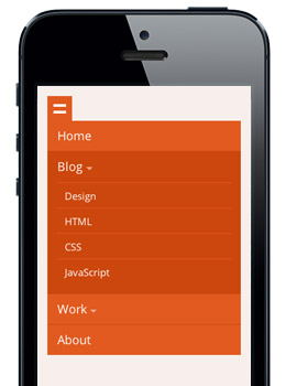
Mobile device menu
Each mobile-first design website has key elements that rarely change. The first is an accordion-style menu.
Mobile-first is content first
When a mobile website is developing, content is crucial. Design should give its consumers exactly what they need without compromising the quality of content. It may also cause distraction from the user experience. Mobile-first designs have limitations such as screen width and broadband, which could lead to poor priority. This strict limitation forces designers to remove all extraneous features so that it is easier to concentrate on the essentials. The fact that some things can be extraneous does not necessarily mean they are no longer necessary. Typically, extraneous content may be elements that your mobile user does not need to view.
Your content such as text, images, and maps should adjust in size to be easy to read. A good font size to use for your text should be no less than 16px.
Mobile-first design & user experience
Websites designed mobile-first change the user’s experience. This is because most elements are scaled-down and presented differently than on a desktop. However, this does not mean that web designers and web developers should not pay equal attention to all devices. Moreover, optimize all devices to achieve the best result.
We want to avoid a situation where your website is well done on one device and poorly designed on other devices. As a business owner, you want to ensure that you cover all your bases to meet the demands of your customers.
Mobile-first design examples

Establish the visual hierarchy of your content
The content you’re writing for an online site must be clear as possible to the users. Give your audience what they seek. Eliminate unnecessary information and clutter to avoid distractions. Smartphones have limitations in screen sizes, it is essential to display content in a way that respects hierarchy. A visual hierarchy of your content will help you identify the factors that need the most attention. Optimized content improves website performance, enabling user experiences.
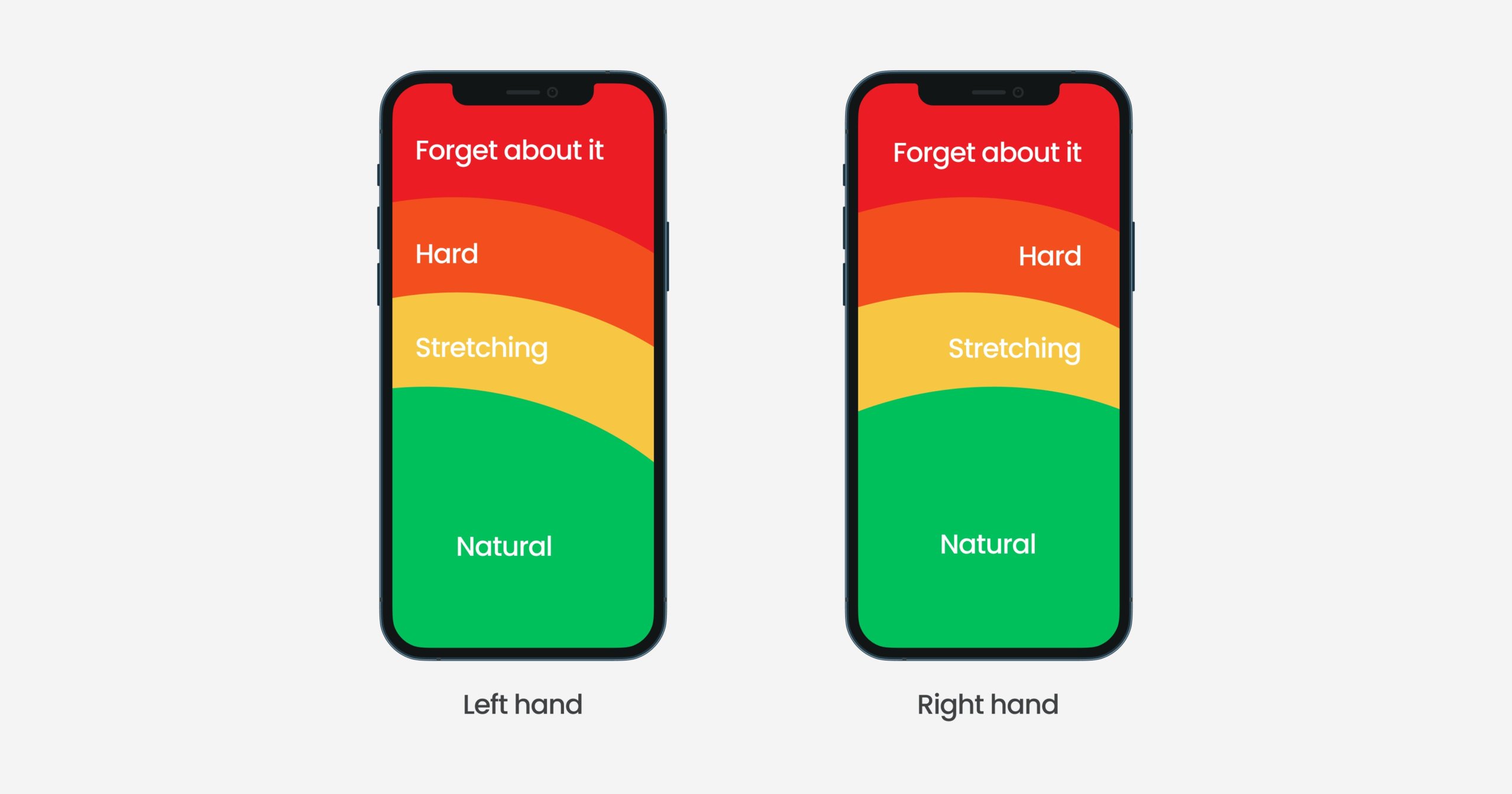
Furthermore, it is also key to place important elements within the thumb’s reach 👍. You want content, links, buttons, etc. to be easy to click 🖱. Check out this image from Maddevs.io below:
Work on your site loading speed
Research shows that users leave websites after requiring three seconds of them. A survey found that 79% of shoppers will not purchase if a website fails. The speed of loading of websites can affect both search engine ranking and customer satisfaction. Mobile devices will load faster than desktops or tablets. It is therefore essential for websites to remove useless features, and it’s a critical point.
Also, if you want to avoid customers leaving your website due to poor website performance and loading speed, you should build your webpage on Jamstack. When our developers create websites using Jamstack architecture, we guarantee that your site will be ultra-fast. Additionally, it will achieve results above 90 on PageSpeed Insights (mobile devices).

Place Your Users At The Front Of Your Design
When designing websites for mobile devices, you should start researching how they will use/navigate your site. A mobile-first website will assist your visitors in completing tasks or solving a problem easily. The second critical step is finding the user flow or user journey for mobile websites in a mobile-friendly way. Try to consider different user behavior scenarios on the page and adapt the user journey as needed to meet their needs. Make it easy for your customers to access your website. A popular way to check which points your users spends the most time in programs such as hotjar.
Tell me the difference between responsive web design and mobile responsive design?
Mobile-first web designs are essentially designed for mobile screen-based websites. This is the opposite of the traditional approach. The traditional approach starts with desktops scaling for smaller screens. Generally, content and navigational layouts decrease on smartphones. This is because the focus is on traditional desktop websites. The concept of mobile-based design has similar characteristics to designing a mobile app. It is just adjusting the layout of the mobile phone. However, it retains the characteristics of an excellent user experience. Characteristics such as high speed and streamlined information for engaging.
Do you want to check the health of your website?

Mobile-first design strategy summary
Deciding to design your website using the mobile-first strategy is a great way to ensure the success of your business and brand. This strategy allows you to simplify your website to provide users with only must-have elements. Furthermore, the navigation of your website or eCommerce store will be simple, thus encouraging users to buy, order or contact you.
Additionally, the mobile-first approach makes developing a website easier. It’s because going from a small screen size 📱 to a large screen size 🖥 is more natural than the reverse.
Another key factor that should convince you to go mobile-first design for your next website or eCommerce store, is Google indexing. Google indexes websites’ mobile-first and then desktop. If your site is mobile user-friendly, you will have a higher rank on search engines.
If I have sold you on the mobile-first design you want to consider how you display your content, the navigation in the website itself, and the rule of thumb. What the user cannot reach in a swift motion, they will likely ignore. Also, you want to have high-quality images for your products to attract website users.
Comments