 Skip to Navigation
Unlock the secrets to seamless form design with our expert guide! Learn the dos and don’ts that will revolutionize user experience, making your forms a joy to fill out.

Let’s delve into the dos and don’ts of form design, exploring the principles and best practices that can elevate your forms from functional to exceptional. Whether you’re a seasoned designer looking to refine your approach or a newcomer seeking to grasp the fundamentals, this post will equip you with the insights and strategies needed to create forms. Forms that not only fulfill their purpose but also delight users along the way.
From layout and labeling to validation and accessibility, we’ll dissect every aspect of form design. We will also, uncover common pitfalls to avoid and proven techniques to embrace. So, buckle up as we embark on a journey to master the art of form design. Discover the full potential of your digital interactions.
The importance of form design in user experience and conversion rate
Form design plays a pivotal role in shaping user experience and ultimately impacting conversion rates. A well-crafted form not only facilitates smooth interaction but also instills trust and confidence in users. By optimizing the layout, labels, and input fields, designers can streamline the completion process. Thus reducing friction and minimizing errors. Clear instructions and intuitive design elements guide users through each step. Therefore, enhancing usability and reducing abandonment rates.
Moreover, thoughtful form design fosters a positive perception of the brand, reflecting its commitment to user-centricity and attention to detail. Ultimately, the synergy between form design and user experience can significantly influence conversion rates. Thus, transforming hesitant visitors into satisfied customers.
Dos of Web Form Design
Let’s go over form design best practices to improve overall user experience and conversion rates. Some of the dos of web form design are using clear form fields, good form order, etc. Explore these and more in detail below.
Clear and Concise Form Fields
When crafting web design, clarity and conciseness in form fields are paramount for user engagement and ease of use. By ensuring that form fields are clearly labeled and succinctly presented, users can swiftly comprehend what information is required. Therefore, reducing frustration and streamlining the submission process.
Clear form fields contribute to a seamless user experience, fostering trust and encouraging completion rates. Effective design should prioritize simplicity and precision in form field presentation, optimizing usability and enhancing overall user satisfaction.
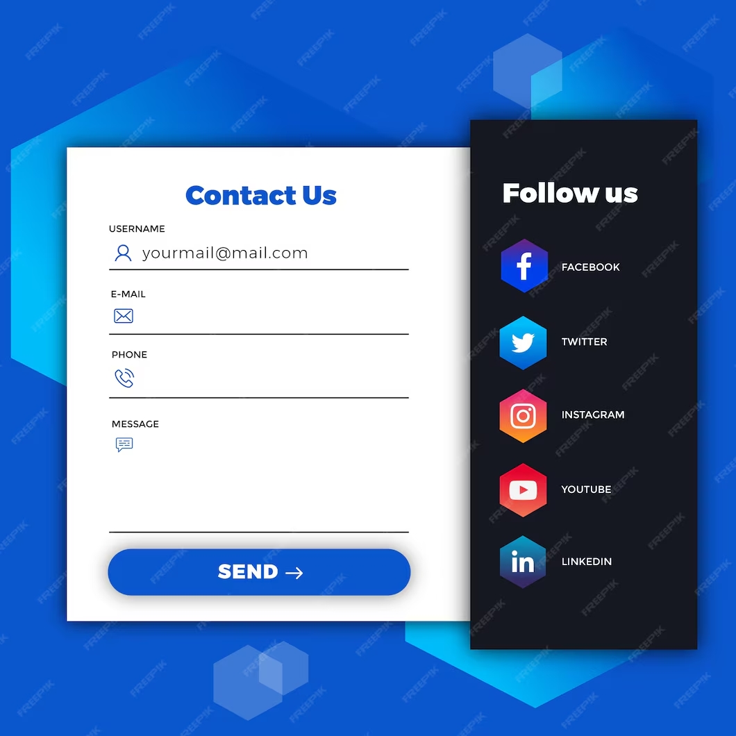
Prioritize Form Field Order
Prioritizing form field orders is a crucial best practice in web design, as it directly impacts user flow and conversion rates. By strategically organizing form fields based on their importance and logical sequence, designers can guide users through the submission process smoothly. Placing essential fields first, such as name and email address, allows users to quickly engage with the form and progress efficiently.
Subsequently, less critical fields can follow, minimizing cognitive load and preventing user abandonment. Prioritizing form field order not only enhances user experience but also increases the likelihood of successful form completions, ultimately contributing to the effectiveness of the website.
For example, consider a newsletter subscription form. The designer prioritizes the form field order by placing the email address field at the top. That should be followed by the name field. This arrangement ensures that users can swiftly enter their email address, the primary requirement. Without unnecessary distractions. You may then include optional fields, such as preferences or demographic information. Thus allowing users to provide supplementary details at their discretion. This prioritization optimizes user engagement and encourages seamless form submission.
Utilize Smart Defaults and Autofill
When designing contact forms for a website, leveraging smart defaults and autofill features can significantly enhance user experience and streamline the submission process. Smart defaults anticipate user inputs based on common patterns or preferences, reducing the effort required to fill out the form. For instance, pre-selecting the user’s country based on their IP address or suggesting the most common inquiry type can expedite form completion.
Autofill capabilities further simplify the process by populating fields with information stored in the user’s browser, such as their name, email address, or phone number, minimizing manual input. By incorporating these features, contact forms become more user-friendly, encouraging engagement and increasing the likelihood of successful submissions.
Allow copy and paste
When crafting contact forms for a website, an essential best practice is to allow users to copy and paste information into form fields. This simple yet effective approach significantly enhances usability by enabling users to quickly input their details from other sources, such as emails or documents.
By removing the need for manual typing, users can save time and reduce the risk of errors, improving their overall experience. Additionally, permitting copy-and-paste functionality demonstrates a commitment to user-centric design, empowering individuals to interact with the form in a manner that aligns with their preferred workflow. In essence, allowing copy-and-paste functionality fosters convenience and efficiency, contributing to a seamless and satisfying user journey.

Mobile compatibility
Ensuring mobile compatibility is a fundamental best practice when creating contact forms for a website. With the increasing prevalence of mobile browsing, it’s crucial to optimize forms for smaller screens and touch interactions. Mobile-compatible contact forms should feature responsive design elements that adapt seamlessly to various screen sizes and orientations.
Additionally, form fields should be appropriately spaced and sized to accommodate touchscreen input, making it easy for users to navigate and input their information. By prioritizing mobile compatibility, website owners can enhance accessibility and user experience across a wide range of mobile devices. Ultimately increasing the likelihood of successful form submissions and fostering positive interactions with their audience.
Apply the progress bar when using long-form
Applying a progress bar to long forms on web pages is crucial for enhancing user experience and optimizing form completion rates. Long forms often encompass numerous form elements, ranging from basic text inputs to complex dropdown menus and file uploads. Navigating through such extensive forms can be daunting for users, leading to frustration and potential abandonment.
A progress bar serves as a visual aid, offering users a clear indication of their advancement through the form. This real-time feedback instills a sense of accomplishment and provides reassurance about the remaining steps, reducing uncertainty and improving engagement. By integrating a progress bar, web developers empower users with transparency and streamline the form-filling process, ultimately fostering a more seamless and satisfying browsing experience.
Include a clear CTA button
Including a clear Call-to-Action (CTA) in forms is crucial for ensuring that users navigate the web page correctly. A well-defined CTA guides users through the intended action, whether it’s submitting information, making a purchase, or signing up for a service.
Without a clear CTA, users may become confused about what steps to take next, leading to frustration and potentially abandoning the form altogether. By providing a distinct CTA, users understand exactly what action is expected of them, resulting in a smoother user experience and higher conversion rates.

Create a clear thank you page
Creating a clear thank you page for users after they’ve submitted a contact form is crucial for enhancing user experience. The thank you page should express gratitude for their submission and reassure them that their message has been successfully received. It can also provide information on what to expect next, such as when they can anticipate a response or any follow-up steps. Including contact information or links to FAQs can further assist users if they have additional questions or concerns.
In addition to a well-designed thank you page, implementing inline validation within the contact form is essential for guiding users through the submission process smoothly. Inline validation offers real-time feedback to users as they fill out each field, indicating whether the information provided meets the required format or criteria.
Providing a clear error message should there be any issues with the form submission, such as missing required fields or incorrect data formats. Communicate errors in a friendly and constructive manner, this will help users understand what went wrong and how to correct it, reducing frustration and improving overall satisfaction with the form experience.
Don’ts of Form Design
Let’s explore some of the don’t of form design.
Avoid Overwhelming Users with Too Many Fields
When designing a form, avoiding overwhelming users with too many fields is paramount for several reasons. Firstly, excessive fields can lead to cognitive overload, causing users to feel frustrated and fatigued, ultimately diminishing their willingness to complete the form. Users may abandon the process altogether if they perceive it as too time-consuming or complex.
Secondly, unnecessary fields increase the likelihood of errors, as users may hastily fill in information or skip fields altogether. This can result in inaccurate data collection, rendering the form less effective for its intended purpose. By streamlining the form to include only essential fields, designers can enhance user experience, encourage higher completion rates, and ensure the accuracy of the collected data.
Moreover, a minimalist approach to form design aligns with the principles of user-centered design, prioritizing the needs and preferences of the end user. Presenting users with a concise and focused set of fields respects their time and attention, fostering a positive interaction with the interface.
By carefully considering the relevance of each field and eliminating unnecessary ones, designers demonstrate empathy for the user’s experience and contribute to a more efficient and satisfying interaction. Ultimately, prioritizing simplicity and clarity in form design cultivates trust and goodwill between users and the interface, facilitating smoother navigation and enhancing overall user satisfaction.

Don’t use unclear error messages
Using unclear error messages in forms can lead to frustration and confusion for users. When input fields generate vague or ambiguous error messages, users may struggle to understand what went wrong and how to correct it. This lack of clarity can result in users failing to fill out the form correctly or abandoning the process altogether.
Clear error messages are essential for guiding users through the data entry process and providing specific feedback on what needs to be corrected and how to do so. By ensuring error messages are concise, informative, and directly related to the input fields, users can navigate forms more efficiently and complete data entry tasks with greater ease.
Don’t Neglect Accessibility Considerations
When designing web contact forms, it’s imperative not to overlook accessibility considerations. One crucial aspect is to group related fields logically, ensuring that the form aligns with the user’s flow. By categorizing fields into logical groups, such as personal information, message details, and submission options, users with disabilities can navigate the form more efficiently. This approach enhances the overall user experience, facilitating seamless interaction for all individuals, regardless of their abilities. Neglecting this aspect could result in a disjointed user journey, hindering usability and potentially deterring users from completing the form.
Moreover, incorporating accessibility features should be an integral part of the design process from inception to implementation. Beyond mere compliance, it’s essential to conduct thorough usability testing, specifically focusing on accessibility parameters. Testing with assistive technologies and diverse user groups allows for identifying potential barriers and refining the form to ensure inclusivity. By prioritizing accessibility in the design of web contact forms, developers can uphold standards of inclusivity, ultimately fostering a more welcoming online environment for all users.
Do you want to check the health of your website?

Don’t ask unnecessary questions
In the realm of form UI design and user experience, it’s crucial to adhere to the principles of simplicity and efficiency. Asking unnecessary questions on a contact form can significantly detract from this goal. Each additional query adds cognitive load for the user, potentially leading to frustration and abandonment of the form.
Moreover, unnecessary questions can disrupt the flow of information exchange and impede the user’s ability to swiftly communicate their intended message. By keeping contact forms concise and focused on essential inquiries, designers can enhance usability, streamline interactions, and ultimately cultivate a more positive user experience.
Don’t make your form unusable
Maintaining usability within your forms is paramount, serving as a cornerstone for optimal user engagement and conversion. The susceptibility of WordPress plugins, often relied upon for form creation, underscores the importance of vigilance in their management. These plugins, while initially robust, can sometimes falter post-update. Thus resulting in glitches that render forms unusable. Whether it’s a compatibility issue with the latest WordPress version or conflicts with other plugins, the consequences can be significant.
Users encountering malfunctioning forms may become frustrated. Thus leading to increased bounce rates and decreased interaction with your site. Moreover, the ripple effect extends to conversion rates. As a frustrating form experience can deter potential leads or customers from completing desired actions. Therefore, it’s imperative to proactively monitor and address any issues that arise. Ultimately, ensuring that your forms remain seamlessly functional to maximize user satisfaction and conversion efficacy.

Don’t make your users wait for your form to load
Making visitors wait for your website’s form to load can have detrimental effects on user experience and overall engagement. Firstly, prolonged loading times often result in higher bounce rates as impatient users are more likely to abandon the page before the form even appears. This not only leads to missed opportunities for conversions but also signals a lack of professionalism, potentially driving away potential customers who expect efficiency and responsiveness.
Moreover, slow-loading forms can undermine the credibility of your website, conveying a sense of untrustworthiness and incompetence. Ideally, all elements on a webpage, including forms, should load within or under two seconds to ensure a seamless user experience and maintain a positive impression of your brand.
Don’t use multiple columns
Using multiple columns for a contact form might seem like a space-saving solution, but it can lead to usability issues. When users encounter multiple fields spread across columns, it disrupts the natural flow of filling out information. They’re forced to scan horizontally, which can be disorienting and tiresome, especially on smaller screens. This layout increases the likelihood of overlooking fields and inputting information incorrectly.
Additionally, it’s challenging to maintain visual hierarchy and alignment across columns, potentially causing confusion. Instead, opting for a single-column layout ensures a straightforward and intuitive user experience, minimizing friction and maximizing completion rates. In a single-column option if you need to add additional fields consider using radio buttons, drop-down fields, etc. This will make the form easier for users to fill out.
Don’t forget to test your forms
After creating your web form or making any tweaks to it, you want to make sure you test it. Testing your contact form ensures that it remains usable and provides website visitors with a positive experience.
There are two types of tests our QA testing department implements when creating a web form or making changes. The first is they will manually click through your contact form to make sure that it is working properly. Secondly, they can create automation tests, that you can schedule to check your contact form daily, hourly, etc. to ensure it’s working properly and in tip-top shape.
Neglecting to test forms can lead to functional errors, such as broken submission buttons or incorrect data validation, ultimately deterring users from completing important actions. By thoroughly testing forms, you can identify and address any issues before they impact user engagement and conversion rates, thus maintaining the integrity and effectiveness of your website.
TL;DR: Summarising best practices of Contact form design
Mastering the art of form design requires a delicate balance of functionality and user experience. By adhering to the dos and don’ts of form design outlined in this guide, you can create intuitive, engaging, and effective forms. Thus enhancing your website’s usability and driving conversions.
Remember, simplicity is key. Streamline your forms, minimize friction, and prioritize clarity to ensure a seamless user journey. Embrace progressive disclosure and smart defaults to guide users through the process effortlessly, while always keeping accessibility in mind.
For those seeking to elevate their UX/UI web design game and craft the perfect contact form, look no further. Incorporate these best practices, unleash your creativity, and watch as your forms become powerful tools for connection and engagement. Ready to revolutionize your website’s user experience? Drop us a line, and let’s create something extraordinary together!
Comments