Navigating a WordPress website should be as intuitive as flipping through a well-organized book. Discover how optimizing menu structures and incorporating user-friendly navigation can elevate your site’s usability and keep visitors engaged.

Let’s explore actionable strategies to streamline WordPress website navigation, ensuring a seamless and delightful user journey. I think we can all agree that navigating a WordPress website can sometimes feel like traversing a labyrinth.
In a digital landscape where user experience reigns supreme, mastering website navigation is paramount. After all, visitors who can’t find what they’re looking for quickly are likely to bounce away. You need to have everything from intuitive menus to strategic placement of links. We’ll help uncover the secrets to optimizing navigation for enhanced user satisfaction and improved engagement. Let’s embark on this journey to transform your WordPress website into a user-friendly haven.
Why does website navigation matter?
Website navigation matters because it serves as the digital roadmap for users navigating through online content. An intuitive and well-structured navigation system enhances user experience by providing clear pathways to desired information or services. Therefore, reducing frustration and increasing engagement.
Effective navigation facilitates efficient exploration of a website, enabling visitors to easily find what they’re looking for and encouraging them to delve deeper into the site’s offerings.
Additionally, streamlined navigation contributes to better search engine optimization (SEO) performance, as search engines favor websites with organized and user-friendly navigation structures. Ultimately leading to increased visibility and traffic.
In essence, website navigation is the cornerstone of user satisfaction and successful online interaction, influencing everything from user retention to conversion rates.
Common Types of Website Navigation
Let’s explore 4 of the most common types of navigation used in web design. These include scrolling, menus, icons, and linked text.
Scrolling and clicking
Scrolling and clicking are two primary methods of navigation on a website, each serving distinct purposes and catering to different user behaviors and preferences. When it comes to scrolling involves vertically moving through the content of a webpage using either a mouse wheel, touchpad gestures, or a scrollbar.
Whereas, clicking involves selecting links, buttons, or interactive elements within a webpage to navigate to different sections of the site or external pages. It allows users to navigate non-linearly, jumping between different pages or sections of a website based on their interests or needs.
Both of these methods cater to different browsing behaviors and content structures. A well-designed website considers both scrolling and clicking interactions to provide users with intuitive and efficient ways to navigate and consume content.
Menus and submenus
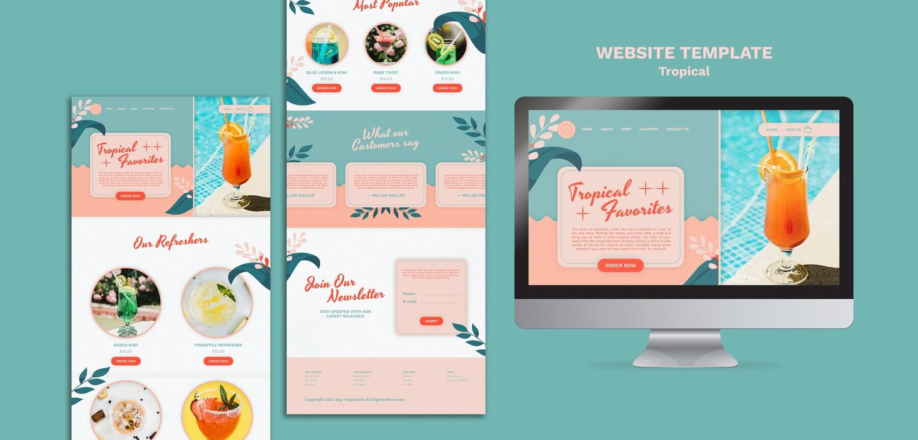
The number one way for users to be able to quickly and easily access the most important content on your site is through the help of menus and submenu items. Menus and submenus are essential components of website navigation, offering users structured access to content and helping them navigate through the website efficiently and intuitively.
Effective design, clear labeling, and accessibility considerations are crucial for creating menus that enhance the overall user experience.
Icon, images, CTA buttons
Another element of navigation on your website includes icons, images, and CTA buttons. Icons, images, and CTA buttons can be linked to other internal web pages. These can help users explore deeper into your website and gain access to more relevant information that they are looking for.
Linked text
When creating web landing pages and blog posts, you may add linked text to navigate users further to more information. Linked text, often referred to simply as hyperlinks or anchor text, is a fundamental aspect of web navigation and usability.
These are text elements within a web page that, when clicked, direct the user to another location. Whether it’s another page within the same website, a different website altogether, or a specific section within the same page (anchor links).
14 Tips for WordPress Website Navigation for Better User Experience
Our WordPress expert team has compiled 14 tips to improve navigation and provide a better user experience.
Keep your site menu structure simple and intuitive
Your site menu items should be straightforward to follow. There are a few different menu options such as a horizontal bar at the top of your site. Or you may decide to pick a sidebar menu. Regardless of what you choose, it should remain consistent across your entire website, to minimize frustration among users.
For mobile devices, you may decide to create a hamburger menu to make it expandable and collapsable. Thus making it easier to use for website visitors.
Do you want to check the health of your website?

Limit menu items
Another tip when creating WordPress website navigation is to limit the number of menu items. Your main menu should only include the most important pages, categories, etc. It should not include every single item that exists on your site.
Ideally, you want to have four to seven main menu items for your website. Similarly, for an eCommerce shop, a good rule of thumb is no more than seven.
Use Descriptive Labels
Using descriptive labels in WordPress website navigation can significantly enhance user experience. Clear and concise labels help visitors quickly understand where each link will lead them.
Instead of generic terms like “Home” or “About,” opt for descriptive labels such as “Our Story” or “Explore Our Services.” These descriptive labels provide context and guide users seamlessly through your site’s content.
Logical order
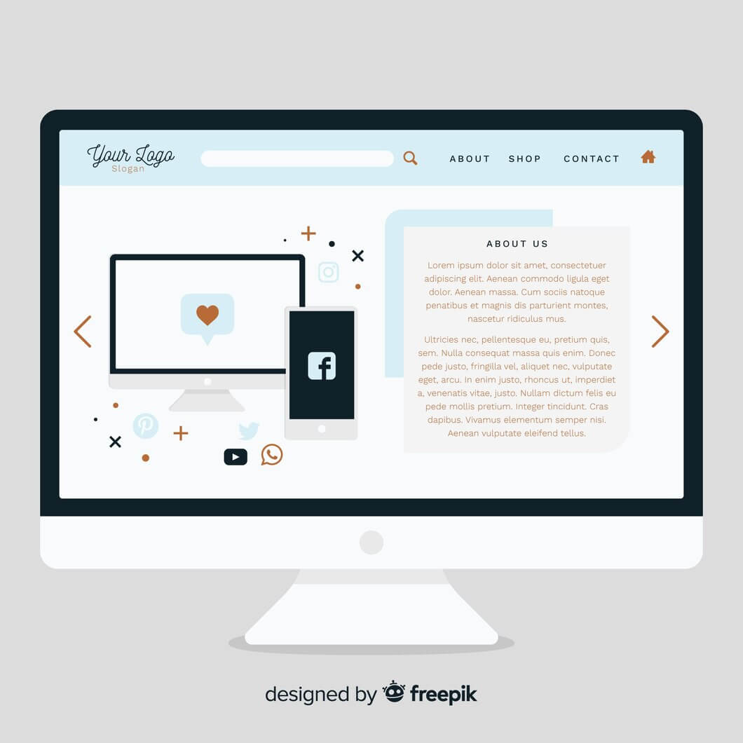
When creating the navigation on your site, it should make logical sense. So, you may decide to start with essential pages like “Home” and “About,” followed by secondary pages or categories.
Arrange items in a hierarchy that reflects the flow of information users expect. Consistency in the order of navigation elements across pages enhances usability and helps users navigate your site more intuitively.
Dropdown menus easy to use
If you are thinking about creating a dropdown menu make sure that they are easy to use. Before diving into implementation, it’s crucial to plan out your menu structure. Consider the hierarchy of your website pages and how they logically relate to each other. Keep the menu simple and intuitive.
Moreover, if you are indeed using WordPress the menu editor enables you to create dropdown menus by simply dragging and dropping menu items below others in a hierarchical structure. Indent the sub-menu items to create dropdowns.
Also, ensure that your dropdown menus work well on different devices, including desktops, tablets, and smartphones. Test the responsiveness of the menus to make sure they are easily accessible and usable on smaller screens.
Finally, make sure that your dropdown menus are accessible to all users, including those using screen readers or keyboard navigation. Use proper HTML markup, and ARIA attributes, and test for accessibility compliance.
Consistent Navigation
Consistent navigation is crucial when users browse your site to create a seamless experience. Ensure that menus and navigation elements appear consistently across all pages. This consistency fosters familiarity and helps users navigate your site with ease.
Whether on desktop or mobile, maintaining uniformity in navigation layout and design enhances usability and encourages exploration of your content.
Mobile-friendly navigation
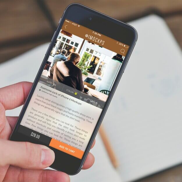
For effective WordPress website navigation, prioritize mobile-friendliness to accommodate users on various devices. Opt for responsive design elements that adapt seamlessly to different screen sizes. You may also consider a mobile-first design to prioritize mobile navigation.
Utilize mobile-specific navigation menus or hamburger menus to optimize space and maintain usability. Streamlining navigation for mobile users enhances accessibility and ensures a positive browsing experience across all devices.
Breadcrumb navigation
Implementing breadcrumb navigation in your WordPress website provides users with clear pathways to navigate through hierarchical content structures. By displaying a trail of links that show the user’s location within the site, breadcrumbs enhance usability and reduce confusion.
This feature is particularly useful for sites with deep content hierarchies or e-commerce platforms with numerous categories and subcategories. Utilizing breadcrumb navigation helps users understand the site’s structure and facilitates efficient navigation to previous pages.
Call-to-Action Buttons
When designing your WordPress website, ensure your CTA buttons have clear and action-oriented labels, guiding users to take desired actions. Place CTA buttons strategically within your content, making them easily accessible without overwhelming the page. Use contrasting colors to make the buttons stand out and grab users’ attention. Lastly, test different variations of CTA buttons and placements to optimize for conversions and user engagement.
Accessibility Considerations
When optimizing your WordPress website’s navigation, prioritize accessibility to ensure inclusivity for all users. Utilize descriptive labels and alt text for navigation elements, aiding users who rely on screen readers or have visual impairments.
Maintain a logical and intuitive navigation structure, allowing users to easily navigate your website using keyboard shortcuts or assistive technologies. Regularly test your website’s accessibility features to identify and address any barriers that may hinder user experience.
Footer navigation
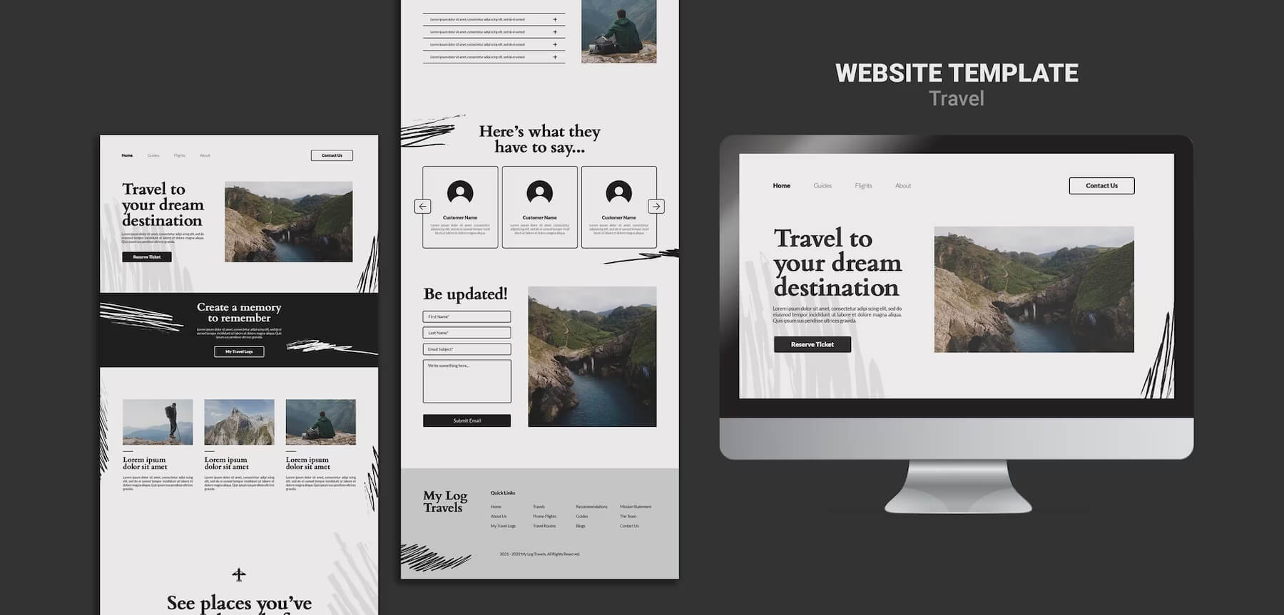
Incorporate a concise and organized footer navigation menu in your WordPress website to enhance user navigation. Include important links such as contact information, privacy policy, and terms of service to improve user experience and trust.
Utilize a simple and clean design for the footer navigation to ensure it complements the overall aesthetics of your website. Regularly review and update the footer navigation to reflect any changes in content or website structure, maintaining relevance and usability.
Cross-linking content
Leverage cross-linking within your WordPress website to enhance navigation and improve user engagement. Strategically link related content within your articles or pages to provide users with additional context and relevant information.
Use descriptive anchor text that accurately represents the linked content, aiding users in understanding where the link will take them. Regularly audit your cross-links to ensure they remain up-to-date and functional, optimizing the user’s journey through your website.
Content grouping
Consider organizing your WordPress website’s content into logical groups to streamline navigation for users. Group related articles, pages, or products together under relevant categories or topics, making it easier for visitors to find what they’re looking for.
Use clear and descriptive category names to guide users effectively through your content hierarchy. Regularly review and refine your content grouping strategy to ensure it aligns with the evolving needs and interests of your audience.
404 Error Page Navigation
Optimize your WordPress website’s 404 error page by including clear navigation options to help users find their way back to relevant content. Provide links to popular pages, categories, or a search bar to facilitate exploration and minimize frustration.
Customize the 404 error page with your website’s branding and a friendly message to maintain a positive user experience. Regularly monitor and analyze 404 error reports to identify broken links and address them promptly, ensuring seamless navigation for visitors.

How Does Navigation Affect the User Experience on a Website?
Navigation plays a crucial role in shaping the user experience (UX) of a website. Here are some ways in which navigation affects UX:
- Reducing user frustration. Confusing or inconsistent navigation can frustrate users, leading to high bounce rates and lower engagement. When users struggle to navigate a website, they are more likely to abandon it altogether.
- Easy to find information. A well-structured navigation system makes it easy for users to find the information they are looking for. Clear labels, logical grouping of content, and intuitive menus contribute to a positive experience.
- Mobile responsiveness. With the increasing use of mobile devices, responsive navigation is essential. Mobile-friendly navigation designs accommodate smaller screens and touch interactions, providing a seamless experience across devices.
- User Engagement and Conversion. Intuitive navigation encourages users to explore more pages and engage with the content. By guiding users through the website effectively, navigation can influence conversion rates and lead to desired actions such as making a purchase or signing up for a newsletter.
Navigation significantly impacts the overall user experience of a website by influencing discoverability, accessibility, engagement, and conversion rates. A well-designed navigation system enhances usability, fosters positive interactions, and ultimately contributes to the success of the website.
TL;DR: Summarising WordPress website navigation best practices
WordPress website navigation plays a pivotal role in enhancing user experience and engagement. It refers to the structure and layout of menus, links, and other elements that help visitors navigate through your site effortlessly. By implementing key strategies such as limiting menu items, maintaining a logical order, and ensuring consistency across pages, you can significantly improve the usability of your WordPress website.
Remember, simplicity is key. A clutter-free navigation menu not only makes it easier for users to find what they’re looking for but also enhances the overall aesthetics of your site. Additionally, organizing menu items in a logical order and maintaining consistency in navigation elements across pages helps users navigate seamlessly, reducing frustration and improving satisfaction.
Looking to revamp your WordPress website’s navigation for a smoother user experience? Our WordPress development services are here to help. Let us streamline your site’s navigation and make it easy for your visitors to find what they need. Drop us a line today to get started on creating a user-friendly website that keeps users coming back for more.
Comments