 Skip to Navigation
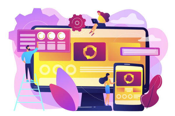
A responsive web design is standard for all websites on the internet. Responsive web design is an application approach to web design that focuses on enhancing web pages to display better on a variety of devices and screens. Let’s explore why that’s important for your WordPress website below.
Responsive web design – a concept that has revolutionized the way we interact with websites on different devices. Responsive web design is not merely a trend but a fundamental principle that shapes modern web development. In this blog post, we delve into the world of responsive web design and explore why it is an indispensable aspect of any WordPress website’s success.
Among the myriad platforms available to build and maintain websites, WordPress stands tall. It is one of the most popular and versatile content management systems. Yet, as the browsing habits of users shift towards mobile devices and various screen sizes, the significance of a seamless user experience has never been more crucial.
With a staggering increase in the number of mobile users accessing the internet, ensuring your 👉WordPress website 👈 adapts flawlessly to diverse screen sizes and resolutions is no longer optional. It’s a strategic imperative. As we journey through the essential aspects of responsive design, we will shed light on its undeniable benefits. These benefits range from improved user engagement and higher search engine rankings. As well as streamlined maintenance and reduced bounce rates.
So, let’s embark on this exploration together, as we uncover the secrets behind crafting WordPress websites. Websites that seamlessly embrace the present. While being ready to conquer the future – through the art and science of responsive web design.
What is responsive web design?
A responsive WordPress theme automatically changes the screen size according to your needs. This means your website can easily be accessed via a smartphone tablet or computer. The majority of internet traffic in Europe comes through smartphones and tablets. Almost half of your visitors visit your website via mobile devices.
If a website doesn’t look good to them, they can immediately exit the website. They won’t see your website again. It’s advisable to choose the responsive theme of WordPress. A responsive theme improves user experience as well as SEO advantages.

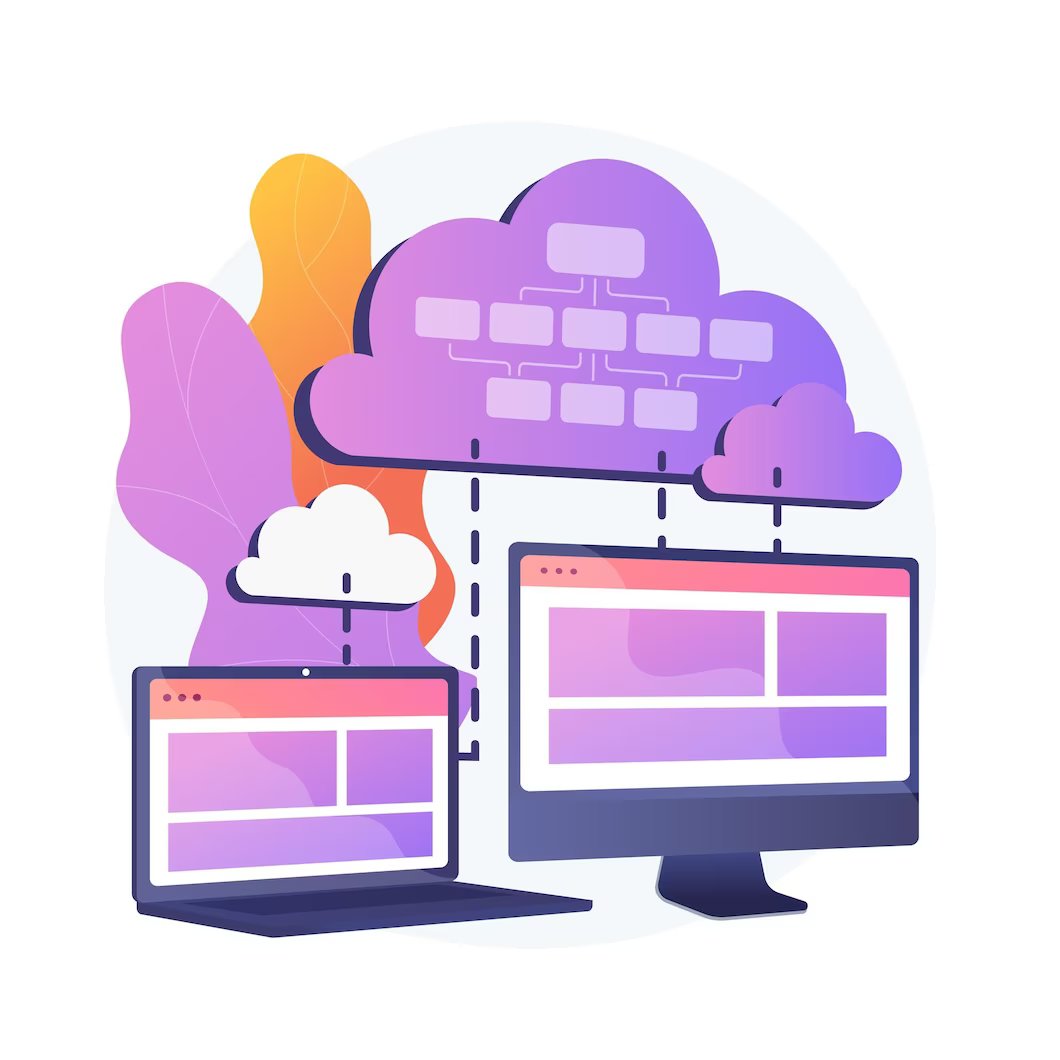
How does a responsive web design work?
Responsive web design is an approach to 👉 designing and developing websites 👈 that ensure optimal viewing and interaction experiences across various devices. As well as various screen sizes. It allows websites to adapt their layout, content, and functionality to provide a consistent and user-friendly experience. Regardless of whether the user is accessing the site on a desktop computer, laptop, tablet, or smartphone.
Here’s how responsive web design works:
1. Fluid Grids:
Responsive design uses fluid grids that automatically adjust the layout and proportions of elements based on the screen size. Instead of using fixed pixel-based measurements, the grid is defined using percentages or relative units. Thus allowing content to resize and rearrange dynamically.
In the good old days, a dynamic value was specified to every HTML document like 400 pixels. In fluid forms, dynamic values are used instead. Values such as percentages of viewing width. This approach increases dynamically and decreases the container element’s size according to the screen dimensions.
2. Flexible Images and Media:
Images and media elements, such as videos or embedded content. They are also made responsive by using CSS techniques. They can be set to resize proportionally or adapt their size and positioning based on the screen size.
3. Media Queries:
The responsive design employs media queries, which are CSS rules that apply specific styles based on the characteristics of the user’s device. Media queries can detect features like screen width, resolution, orientation, and even device capabilities. By defining different sets of styles for different screen sizes, the design can adapt accordingly.
4. Breakpoints:
Breakpoints are specific screen widths at which the layout of the website changes. At each breakpoint, different CSS rules are applied to rearrange or modify the content presentation. Common breakpoints might target popular devices. Devices like smartphones (e.g., 320px wide), tablets (e.g., 768px wide), and desktops (e.g., 1024px wide).
5. Flexible Typography:
Responsive web design also considers the readability and legibility of text across various screen sizes. Typography is often set to scale proportionally. Thus ensuring optimal reading experiences on different devices.
6. Progressive Enhancement:
With responsive design, the core content and functionality of the website are accessible on all devices. However, additional enhancements or optimizations may be added for larger screens. Also, for devices with advanced capabilities. This approach ensures that users on all devices can access the essential content. While still providing an enhanced experience for those on larger screens.
By combining these techniques, responsive web design allows websites to adapt their layout, images, typography, and other elements. In order to provide an optimal user experience on any device. All without the need for separate mobile-specific websites or applications.
Why is a responsive website design for WordPress important?
There are several reasons why a responsive web design is important for WordPress sites. Let’s explore each of them in detail below.
Excellent user experience across all mobile devices
Mobile devices make up about 50% of traffic across the internet this includes WordPress sites. It is important to choose a WordPress theme that will be responsive on various devices. Devices such as mobile phones, tablets, laptops, and other devices. By employing responsive design principles, your website can adapt to various screen sizes and resolutions. Thus ensuring a consistent and user-friendly experience across devices. This eliminates the need for users to manually zoom in or scroll horizontally to access content. This all results in improved usability and customer satisfaction.
Some other ways that a responsive website design improves user experience include:

Improved usability:
A responsive design optimizes the website’s navigation and functionality for smaller screens, making it easier for users to find what they are looking for. Elements like menus, buttons, and forms are adjusted. So they are more finger-friendly on touchscreens. Thus reducing the chance of accidental clicks or misinterpretations.
Mobile-friendly experience:
Since mobile internet usage has surpassed desktop usage in many regions. Having a mobile-friendly website is crucial for reaching a broader audience. A responsive design ensures that mobile users can access and use the website effectively. Thus leading to higher engagement and satisfaction.
Accessibility compliance:
Responsive design can contribute to better accessibility for users with disabilities. It ensures that content is presented in a way that’s readable and navigable for users with visual impairments or other accessibility needs.
Faster load times:
Responsive web design often involves optimizing images and other media for different screen sizes. This can reduce the overall page size and load times. 👉 Faster loading pages 👈 contribute to a positive user experience as users don’t have to wait long to access the content they want.
Future-proofing:
With the increasing variety of devices and screen sizes, responsive design helps ensure that your website will remain usable and visually appealing on new and upcoming devices. This is all without the need for a complete overhaul.
Overall, a well-executed responsive web design enhances user experience. It does so by delivering a seamless and engaging interface across various devices. Therefore improving usability, accessibility, and performance. This positive user experience often translates into higher user engagement. This leads to increased conversions and a better overall perception of your brand or service.

Google prioritizes mobile-first designs
Responsive web design is favored by search engines like Google because it provides a better user experience and eliminates the need for duplicate content. Having a single, responsive website instead of multiple versions improves your SEO efforts. As you can concentrate your optimization on a single URL.
Also, Google adjusted its algorithms a while back indexing 👉 mobile-first designed webpages 👈 higher, than those that are designed to first meet the needs of desktop computers. Google prioritizes mobile-first designs for several reasons. First and foremost, mobile usage has skyrocketed in recent years. A significant portion of internet traffic originates from mobile devices. As a result, Google aims to enhance user experience and accessibility for this rapidly expanding user base. By favoring mobile-first designs, websites are optimized for smaller screens. Moreover, they are created with touch interfaces, and reduced bandwidth in mind. Thus ensuring faster loading times and smoother navigation on mobile devices.
Additionally, Google’s search algorithms now primarily evaluate mobile versions of websites to determine their ranking in search results. This makes mobile-first designs crucial for better search engine visibility and ultimately driving more organic traffic to websites. Embracing a mobile-first approach aligns with Google’s commitment to providing a seamless and user-friendly digital environment. It is catering to the evolving preferences and behaviors of online users.

A responsive design speeds up your page loading time
A responsive design itself does not directly speed up page loading time. However, it indirectly contributes to faster loading times. This is by optimizing the user experience across different devices and screen sizes. Here’s how:
1. Reduced HTTP Requests:
Responsive design allows you to serve the same HTML code to all devices. While also adjusting the layout and presentation using CSS media queries. This eliminates the need to load separate HTML files for different devices. Therefore, resulting in fewer HTTP requests and faster page loading.
2. Efficient Resource Loading:
With responsive design, you can use CSS techniques like responsive images. Which loads different image sizes based on the device’s screen resolution. By serving appropriately sized images, you avoid downloading large images on smaller screens. Therefore reducing the overall page size and improving loading times.
3. Mobile-Optimized Content:
Responsive design enables you to prioritize and 👉 optimize content for mobile devices 👈. You can selectively load or hide certain elements on smaller screens. Thus reducing the amount of data that needs to be transferred. This optimization improves loading times on mobile devices with limited bandwidth.
4. Browser Caching:
When a responsive design is implemented, the browser can cache resources like CSS and JavaScript files. This means that subsequent visits to your site by the same user will not require re-downloading those files. Thus resulting in faster load times.
5. Improved Server Performance:
With responsive design, you don’t need separate mobile-specific websites or server-side redirects. This reduces the load on your server and eliminates the need for additional processing, resulting in improved server performance and faster response times.
It’s important to note that while responsive design can contribute to faster loading times, there are many other factors that affect page speed. These include optimizing images, minifying CSS and JavaScript, leveraging browser caching, and 👉 using a content delivery network (CDN) 👈, among others. To achieve the best performance, it’s recommended to consider these factors in addition to implementing a responsive design.

Lowers bounce rate
A modern WordPress theme that is responsive across all devices, especially mobile devices will have a lower bounce rate. For mobile users, they want to be able to access all the same info, functions, etc. on their phone or tablet, as they would on a desktop computer.
If your site is not suitable for mobile devices, users will quickly leave your site and go to the competitor. Users don’t have time to struggle with a site that isn’t adapted to mobile devices. Your site should look and function the same way on a phone, tablet, and computer. A user shouldn’t have to leave their mobile site to access something on the desktop version.
A responsive web design plays a vital role in reducing bounce rates, resulting in a more engaging user experience. By adapting seamlessly to various screen sizes and devices, responsive websites ensure that visitors can easily access and navigate the content. Regardless of whether they are using a desktop, tablet, or smartphone.
This enhanced accessibility and user-friendliness foster longer user sessions. So visitors are more likely to stay and explore the site’s offerings. With faster loading times and smoother interactions, users are less inclined to abandon the website due to frustration caused by cumbersome interfaces on different devices. Consequently, the reduced bounce rate leads to increased retention. This leads to improved conversion rates and a positive impact on search engine rankings. Thus making responsive web design an indispensable element for any modern website. It is key for websites that are striving to maximize their online presence and engagement.

It makes the development process easier
A powerful WordPress responsive theme makes the development process for developers much easier. Responsive web design, by its nature, aims to provide an optimal viewing experience across a wide range of devices and screen sizes. It achieves this by utilizing flexible layouts, fluid grids, and media queries. Here are several ways in which responsive web design can make the development process easier:
- Single Codebase: With responsive web design, you can maintain a single codebase for your website. It adapts and adjusts itself based on the device and screen size. This eliminates the need to create and maintain separate versions of your website for different devices. Devices such as desktops, tablets, and smartphones. Consequently, it simplifies the development process, as you only need to write and manage one set of code.
- Improved Efficiency: Responsive design allows you to optimize your development process by streamlining your workflow. You don’t have to spend time and effort on duplicating code. Moreover, you don’t have to spend time managing multiple versions of the same website. This increased efficiency translates to faster development cycles and quicker updates.
- Maintenance and Updates: Maintaining a responsive website is generally easier than managing multiple versions. When updates or bug fixes are required, you only need to implement them once. It’s much easier than having to do this across various versions. This simplifies the 👉 WordPress maintenance 👈 process and reduces the chances of introducing inconsistencies or errors.
By embracing responsiveness, you can create a more flexible, adaptable, and user-friendly website. All while streamlining the development workflow.

Flexibility & Scalability
The responsive approach helps future-proof your website to a certain extent. As new devices with different screen sizes and resolutions emerge. A responsive design ensures that your site can adapt to them without requiring a complete redesign or redevelopment. This scalability saves time and resources in the long run. You can expand or collapse your site as your business grows and shrinks. You don’t have to put in a ton of extra money in order to make this happen.
Some other ways that a responsive WordPress theme provides you with flexibility and scalability include:
Device compatibility:
A responsive design ensures that your website functions well on different devices. Devices include desktops, laptops, tablets, and smartphones. This adaptability enables a seamless user experience regardless of the device they use to access your site.
Screen size responsiveness:
Responsive web design uses fluid grids and flexible elements. Elements that can adjust and resize based on the screen size. This ensures that your website’s layout and content are optimized for any screen. Thus preventing issues like content cutoff or horizontal scrolling.
Future-proofing:
With the ever-changing landscape of devices and screen sizes, responsive design future-proofs your website to a large extent. As new devices with different screen dimensions are released. So a responsive website will be better prepared to accommodate them without requiring a complete redesign.
Maintenance efficiency:
Managing a single responsive website is more efficient than maintaining multiple versions. For example separate desktop and mobile sites. With a responsive design, you only need to update content and make changes in one place. Thus saving time and resources.
Do you want to check the health of your website?

Cost-effectiveness:
Though initially, building a responsive website may require more investment than a traditional static website. It proves to be more cost-effective in the long run. The 👉 maintenance costs 👈 for managing multiple versions or fixing issues related to incompatible devices are significantly reduced with responsive design.
Analytical insights:
By using responsive design, your website analytics and user behavior data are consolidated. Everything is on one platform. This simplifies the analysis process. Thus allows you to make data-driven decisions based on a complete picture of your audience.
Overall, having a responsive web design empowers you to create a user-friendly experience. One that adapts to the needs of your visitors regardless of the device they are using. This flexibility not only improves usability and user satisfaction. But also supports your business objectives in an increasingly diverse and dynamic digital landscape.

Using responsive WordPress themes will better your brand image
There is a number of free WordPress responsive theme that you can choose from. Each of them can help boost your brand image. There are many responsive themes that can be used to create websites. Websites for any industry and business.
But if you are looking for the best responsive WordPress themes, you should consider custom-developed designs. A custom website layout will not only be mobile-friendly. But also meet your exact needs as a WordPress site owner.
Responsive web design for WordPress example
Here’s an example of a responsive web design implemented on a WordPress site:
1. Start by choosing a responsive WordPress theme.
Many modern WordPress themes come with built-in responsiveness. Thus ensuring that your website adapts to different screen sizes and devices. For this example, let’s assume we’re using the “Twenty Twenty-One” theme. This is a default theme in WordPress.
2. Customize the theme to match your design preferences.
You can change colors, fonts, and layout options through the WordPress Customizer or theme settings. Make sure to keep responsiveness in mind while making modifications.
3. Create a responsive menu.
In the WordPress dashboard, go to Appearance > Menus. Build your menu structure and enable the responsive menu option. This will ensure that your menu transforms into a mobile-friendly version, such as a hamburger menu, on smaller screens.
4. Design your content with responsiveness in mind.
Use responsive units like percentages or relative values (em, rem) instead of fixed pixel values for width, height, and margins. This allows your content to adapt to different screen sizes.
5. Test your website on various devices.
Use responsive design testing tools or view your website on different devices. In order to ensure it looks and functions the same way across all devices. Devices such as desktops, tablets, and mobile devices. Make adjustments as necessary.
6. Optimize images for responsiveness.
Large images can slow down your website, especially on mobile devices. Use an image optimization plugin or service to compress and resize images. Making them suitable for different screen sizes, and improving loading times.
7. Consider mobile-specific features.
You can enhance the mobile experience by utilizing features like touch-friendly navigation. You can also use swipeable carousels or collapsing sections. Plugins and custom development can help put in place these features on your WordPress site.
8. Ensure readability and usability on smaller screens.
Check that your text is legible and buttons are easily clickable on mobile devices. Adjust font sizes, line heights, and button sizes as needed to provide a good user experience.
Remember, this is just a basic example of implementing responsive web design on WordPress. The specific steps may vary. It depends on the theme you choose and the customization options available.
TL;DR: Final thoughts about the importance of a responsive web design for WordPress
The significance of a responsive web design for WordPress sites cannot be overstated in today’s digital landscape. With the proliferation of mobile devices and varying screen sizes, ensuring that websites adapt seamlessly to different platforms has become a fundamental requirement for success. A responsive WordPress site enhances user experience. This is by providing a consistent and accessible interface, regardless of the device used to access it.
This not only improves user engagement and satisfaction but also positively impacts search engine rankings. As search algorithms increasingly favor mobile-friendly sites. Moreover, a responsive design streamlines website maintenance and content management. As administrators can update and manage a single site that serves all devices, eliminating the need for separate versions.
By embracing responsive web design for WordPress sites, businesses, and content creators demonstrate their commitment to staying relevant. Moreover, WordPress sites remain accessible in the ever-evolving digital world. Thus ultimately leading to increased traffic, conversions, and overall online success.
Want to learn more about responsive web designs for WordPress sites? 👉 Drop us a line 👈 and let’s chat. Let’s discuss the importance of a responsive website design. Our WordPress support services can help maintain your site across all devices.
Comments